PK/PD, Exposure-Response - Continuous
Alison Margolskee, Fariba Khanshan
Overview
This document contains exploratory plots for continuous PD data as well as the R code that generates these graphs. The plots presented here are based on simulated data (see: PKPD Datasets). Data specifications can be accessed on Datasets and Rmarkdown template to generate this page can be found on Rmarkdown-Template. You may also download the Multiple Ascending Dose PK/PD dataset for your reference (download dataset).
Setup
library(ggplot2)
library(dplyr)
library(tidyr)
library(gridExtra)
library(xgxr)

#flag for labeling figures as draft
status = "DRAFT"

## ggplot settings
xgx_theme_set()

#directories for saving individual graphs
dirs = list(
  parent_dir= tempdir(),
  rscript_dir  = "./",
  rscript_name = "Example.R",
  results_dir  = "./",
  filename_prefix   = "",
  filename     = "Example.png")
Load Dataset
#load dataset
pkpd_data <- read.csv("../Data/Multiple_Ascending_Dose_Dataset2.csv")

DOSE_CMT = 1
PK_CMT = 2
PD_CMT = 3
SS_PROFDAY = 6 # steady state prof day
PD_PROFDAYS <- c(0, 2, 4, 6)
TAU = 24 # time between doses, units should match units of TIME, e.g. 24 for QD, 12 for BID, 7*24 for Q1W (when units of TIME are h)

#ensure dataset has all the necessary columns
pkpd_data = pkpd_data %>%
  mutate(ID      = ID,     #ID   column
         TIME    = TIME,   #TIME column name
         NOMTIME = NOMTIME,#NOMINAL TIME column name
         PROFDAY = 1 + floor(NOMTIME / 24), #PROFILE DAY day associated with profile, e.g. day of dose administration
         LIDV    = LIDV,   #DEPENDENT VARIABLE column name
         CENS    = CENS,   #CENSORING column name
         CMT     = CMT,    #COMPARTMENT column
         DOSE    = DOSE,   #DOSE column here (numeric value)
         TRTACT  = TRTACT, #DOSE REGIMEN column here (character, with units),
         LIDV_NORM = LIDV/DOSE,
         LIDV_UNIT    = EVENTU,
         DAY_label = ifelse(PROFDAY > 0, paste("Day", PROFDAY), "Baseline")
  )

#create a factor for the treatment variable for plotting
pkpd_data = pkpd_data %>%
  arrange(DOSE) %>%
  mutate(TRTACT_low2high = factor(TRTACT, levels = unique(TRTACT)),
         TRTACT_high2low = factor(TRTACT, levels = rev(unique(TRTACT))))

#create pk and pd datasets
pk_data <- pkpd_data %>%
  filter(CMT==PK_CMT)

pd_data <- pkpd_data %>%
  filter(CMT==PD_CMT)

#create wide pkpd dataset for plotting PK vs PD
pkpd_data_wide <- pd_data %>%
  select(ID, NOMTIME, PD = LIDV) %>%
  right_join(pk_data) %>%
  rename(CONC = LIDV)%>%
  filter(!is.na(PD))%>%
  filter(!is.na(CONC))

#perform NCA, for additional plots
NCA = pk_data %>%
  group_by(ID, DOSE) %>%
  filter(!is.na(LIDV)) %>%
  summarize(AUC_0 = ifelse(length(LIDV[NOMTIME > 0 & NOMTIME <= TAU]) > 1,
                              caTools::trapz(TIME[NOMTIME > 0 & NOMTIME <= TAU],
                                      LIDV[NOMTIME > 0 & NOMTIME <= TAU]),
                              NA),
            Cmax_0     = ifelse(length(LIDV[NOMTIME > 0 & NOMTIME <= TAU]) > 1,
                              max(LIDV[NOMTIME > 0 & NOMTIME <= TAU]),
                              NA),
            AUC_tau = ifelse(length(LIDV[NOMTIME > (SS_PROFDAY-1)*24 &
                                           NOMTIME <= ((SS_PROFDAY-1)*24 + TAU)]) > 1,
                             caTools::trapz(TIME[NOMTIME > (SS_PROFDAY-1)*24 &
                                                   NOMTIME <= ((SS_PROFDAY-1)*24 + TAU)],
                                     LIDV[NOMTIME > (SS_PROFDAY-1)*24 &
                                            NOMTIME <= ((SS_PROFDAY-1)*24 + TAU)]),
                             NA),
            Cmax_tau     = ifelse(length(LIDV[NOMTIME > (SS_PROFDAY-1)*24 &
                                                NOMTIME <= ((SS_PROFDAY-1)*24 + TAU)]) > 1,
                             max(LIDV[NOMTIME > (SS_PROFDAY-1)*24 &
                                        NOMTIME <= ((SS_PROFDAY-1)*24 + TAU)]),
                             NA),
            SEX      = SEX[1], #this part just keeps the SEX and WEIGHTB covariates
            WEIGHTB  = WEIGHTB[1]) %>%
  gather(PARAM, VALUE,-c(ID, DOSE, SEX, WEIGHTB)) %>%
  ungroup() %>%
  mutate(VALUE_NORM = VALUE/DOSE,
         PROFDAY = ifelse(PARAM %in% c("AUC_0", "Cmax_0"), 1, SS_PROFDAY))

#add response data at day 1 and steady state to NCA for additional plots
NCA <- pd_data %>% subset(PROFDAY %in% c(1, SS_PROFDAY),) %>%
  select(ID, PROFDAY, DAY_label, PD = LIDV, TRTACT_low2high, TRTACT_high2low) %>%
  merge(NCA, by = c("ID","PROFDAY"))

#units and labels
time_units_dataset = "hours"
time_units_plot    = "days"
trtact_label       = "Dose"
dose_units         = unique((pkpd_data %>% filter(CMT == DOSE_CMT) )$LIDV_UNIT) %>% as.character()
dose_label         = paste0("Dose (", dose_units, ")")
conc_units         = unique(pk_data$LIDV_UNIT) %>% as.character()
conc_label         = paste0("Concentration (", conc_units, ")")
concnorm_label     = paste0("Normalized Concentration (", conc_units, ")/", dose_units)
AUC_units          = paste0("h.", conc_units)
pd_units           = unique(pd_data$LIDV_UNIT) %>% as.character()
pd_label           = paste0("Continuous PD Marker (", pd_units, ")")
Provide an overview of the data
Summarize the data in a way that is easy to visualize the general trend of PD over time and between doses. Using summary statistics can be helpful, e.g. Mean +/- SE, or median, 5th & 95th percentiles. Consider either coloring by dose or faceting by dose. Depending on the amount of data one graph may be better than the other.
PK and PD marker over time, colored by Dose, mean (95% CI) percentiles by nominal time
Observe the overall shape of the average profiles. Does the effect appear to increase and decrease quickly on a short time scale, or does is occur over a longer time scale? Do the PK and PD profiles appear to be on the same time scale, or does the PD seem delayed compared to the PK? Is there clear separation between the profiles for different doses? Does the effect appear to increase with increasing dose? Do you detect a saturation of the effect?
#PK data
gg <- ggplot(data = pk_data,
             aes(x = NOMTIME,y = LIDV, color = TRTACT_high2low, fill = TRTACT_high2low))
gg <- gg + xgx_stat_ci(conf_level = .95)
gg <- gg + xgx_annotate_status(status)
gg <- gg + xgx_scale_x_time_units(units_dataset = time_units_dataset,
                                  units_plot    = time_units_plot)
gg <- gg + guides(color = guide_legend(""), fill = guide_legend(""))
gg <- gg + xgx_scale_y_log10()
gg <- gg + labs(y = conc_label)
print(gg)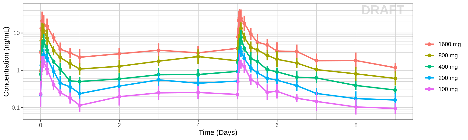
#PD data
gg %+% (data = pd_data) + scale_y_continuous() + labs(y = pd_label)
PK and PD marker over time, faceted by Dose, mean (95% CI) by nominal time
#PK data
gg <- ggplot(data = pk_data,
             aes(x = NOMTIME,y = LIDV))
gg <- gg + xgx_stat_ci(conf_level = .95)
gg <- gg + xgx_scale_x_time_units(units_dataset = time_units_dataset,
                                  units_plot    = time_units_plot)
gg <- gg + guides(color = guide_legend(""),fill = guide_legend(""))
gg <- gg + facet_grid(~TRTACT_low2high)
gg <- gg + xgx_scale_y_log10()
gg <- gg + labs(y = conc_label)
print(gg)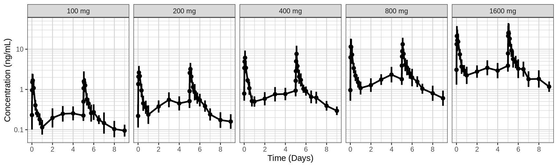
#PD data
gg %+% (data = pd_data %>% subset(DOSE>0)) + scale_y_continuous() + labs(y = pd_label)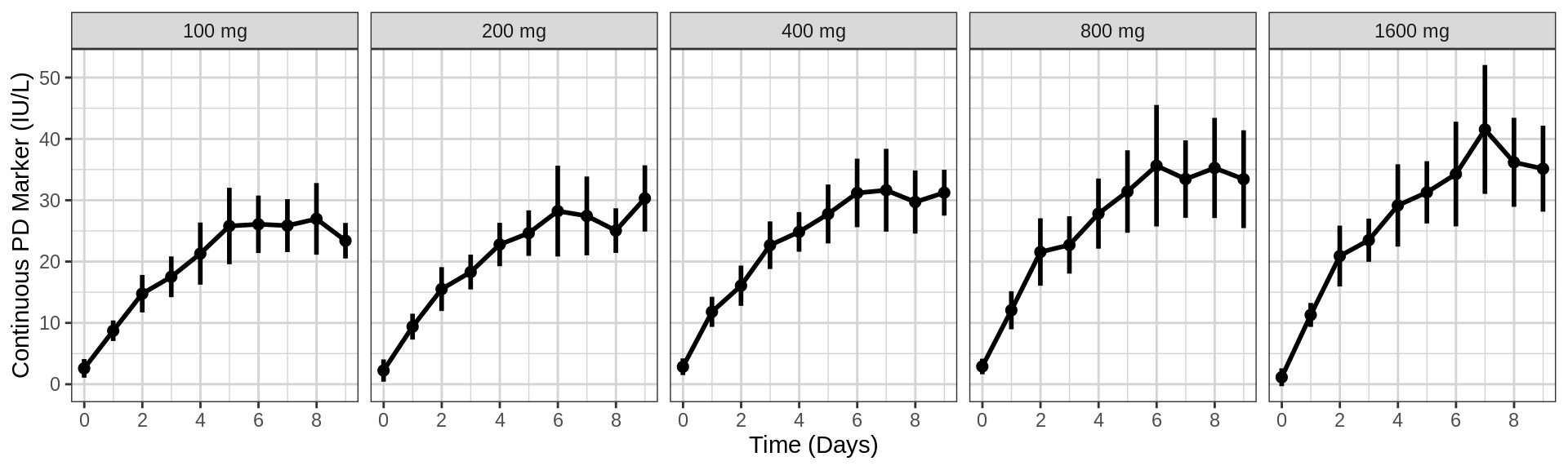
Explore variability
Use spaghetti plots to visualize the extent of variability between individuals. The wider the spread of the profiles, the higher the between subject variability. Distinguish different doses by color, or separate into different panels. If coloring by dose, do the individuals in the different dose groups overlap across doses? Dose there seem to be more variability at higher or lower concentrations?
PK and PD marker over time, colored by Dose, dots & lines grouped by individuals
#PK data
gg <- ggplot(data = pk_data,
             aes(x = TIME, y = LIDV,group = ID, color = factor(TRTACT_high2low)))
gg <- gg + xgx_annotate_status(status)
gg <- gg + geom_line(alpha = 0.5)
gg <- gg + geom_point(alpha = 0.5)
gg <- gg + guides(color = guide_legend(""), fill = guide_legend(""))
gg <- gg + xgx_scale_x_time_units(units_dataset = time_units_dataset,
                                  units_plot    = time_units_plot)
gg <- gg + geom_point(data = pk_data %>% subset(CENS == 1,), color = "red", shape = 8,alpha = 0.5)
gg <- gg + xgx_scale_y_log10()
gg <- gg + labs(y = conc_label)
print(gg)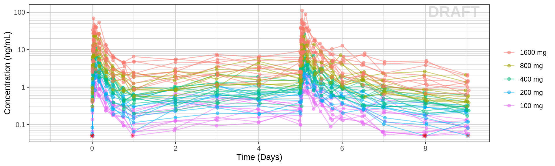
#PD data
gg %+% (data = pd_data %>% subset(DOSE>0)) + scale_y_continuous() + labs(y = pd_label)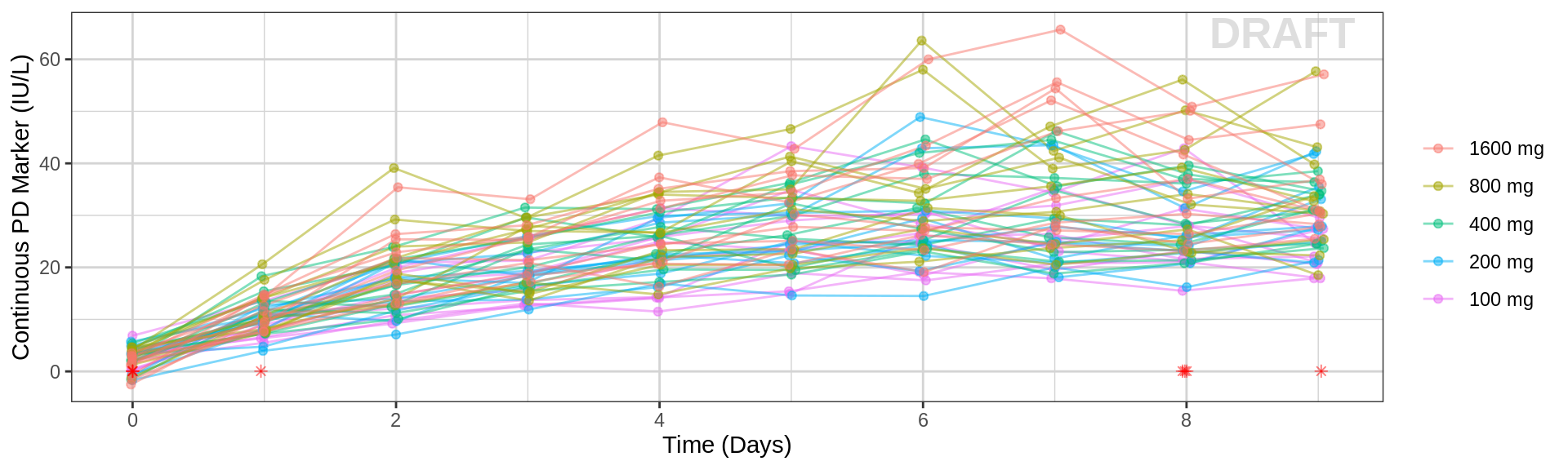
PK and PD marker over time, faceted by Dose, dots & lines grouped by individuals
#PK data
gg <- ggplot(data = pk_data, aes(x = TIME, y = LIDV, group = ID))
gg <- gg + xgx_annotate_status(status)
gg <- gg + geom_line(alpha = 0.5)
gg <- gg + geom_point(alpha = 0.5)
gg <- gg + guides(color = guide_legend(""), fill = guide_legend(""))
gg <- gg + xgx_scale_x_time_units(units_dataset = time_units_dataset,
                                  units_plot    = time_units_plot)
gg <- gg + facet_grid(~TRTACT_low2high)
gg <- gg + xgx_scale_y_log10()
gg <- gg + labs(y = conc_label)

gg1 <- gg + geom_point(data = pk_data %>% subset(CENS==1,), color="red", shape=8, alpha = 0.5)
print(gg1)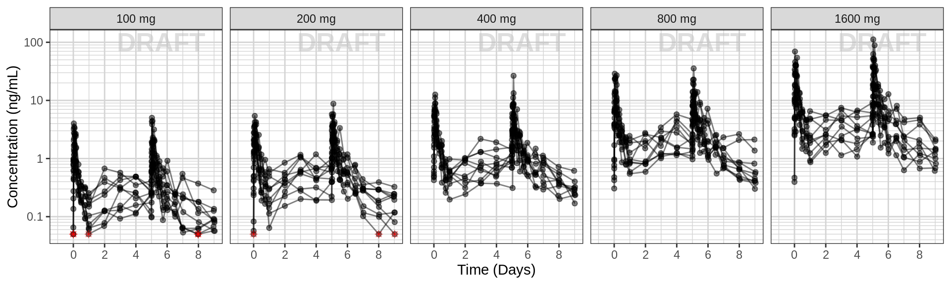
#PD data
gg %+% (data = pd_data %>% subset(DOSE>0)) + scale_y_continuous() + labs(y = pd_label)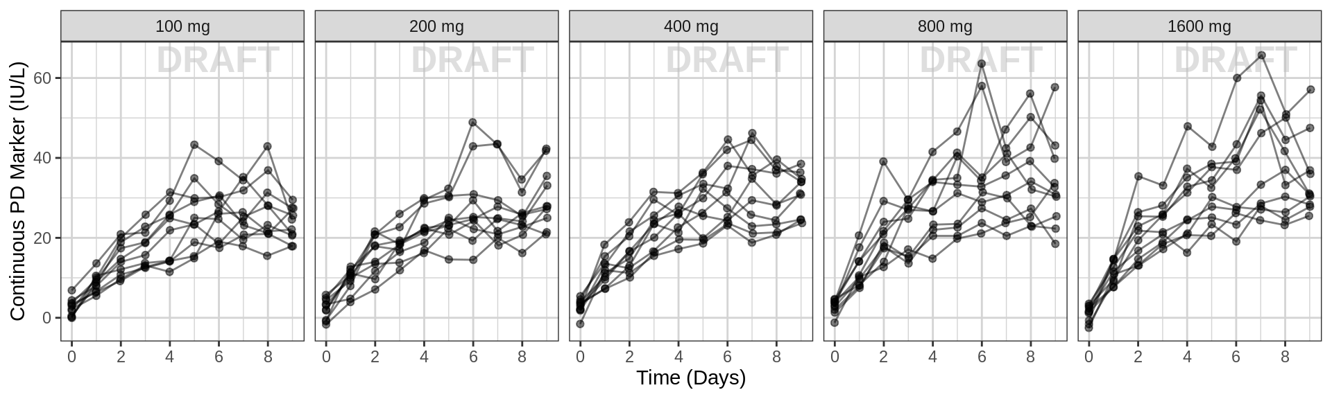
Explore Exposure-Response Relationship
PD marker by Concentration, for endpoint of interest, mean (95% CI) by concentration bins
Plot PD marker against concentration. Do you see any relationship? Does response increase (decrease) with increasing dose? Are you able to detect a plateau or emax (emin) on the effect?
Warning: Even if you don’t see an Emax, that doesn’t mean there isn’t one. Be very careful about using linear models for Dose-Response or Exposure-Response relationships. Extrapolation outside of the observed dose range could indicate a higher dose is always better (even if it isn’t).
gg <- ggplot(data = pkpd_data_wide %>% subset(PROFDAY == SS_PROFDAY,), aes(x = CONC,y = PD))
gg <- gg + xgx_annotate_status(status)
gg <- gg + geom_point(aes(color = TRTACT_high2low))
gg <- gg + geom_point(data = pkpd_data_wide %>% subset(CENS==1,), color="red", shape = 8)
gg <- gg + labs(x = conc_label , y = pd_label)
gg <- gg + guides(color = guide_legend(""))

gg <- gg + xgx_geom_smooth_emax(color = "black")
## Note: if the above line doesn't work, try modifying the formula,
##       initial estimates, or lower bounds in the following code
# gg <- gg + xgx_geom_smooth(color = "black", method = "nlsLM",
#                            formula = y ~ E0 + Emax*x/(ED50 + x),
#                            method.args = list(
#                              start = list(Emax = 1, ED50 = 1, E0 = 1),
#                              lower = c(-Inf, 0, -Inf)))

gg <- gg + xgx_stat_ci(bins = 4, geom = "point", shape = 0, size = 4)
gg <- gg + xgx_stat_ci(bins = 4, geom = "errorbar")

gg1 <- gg + ggtitle("Concentration on Linear Scale")
gg2 <- gg + xgx_scale_x_log10() + ggtitle("Concentration on Log Scale")

grid.arrange(gg1,gg2,nrow = 1)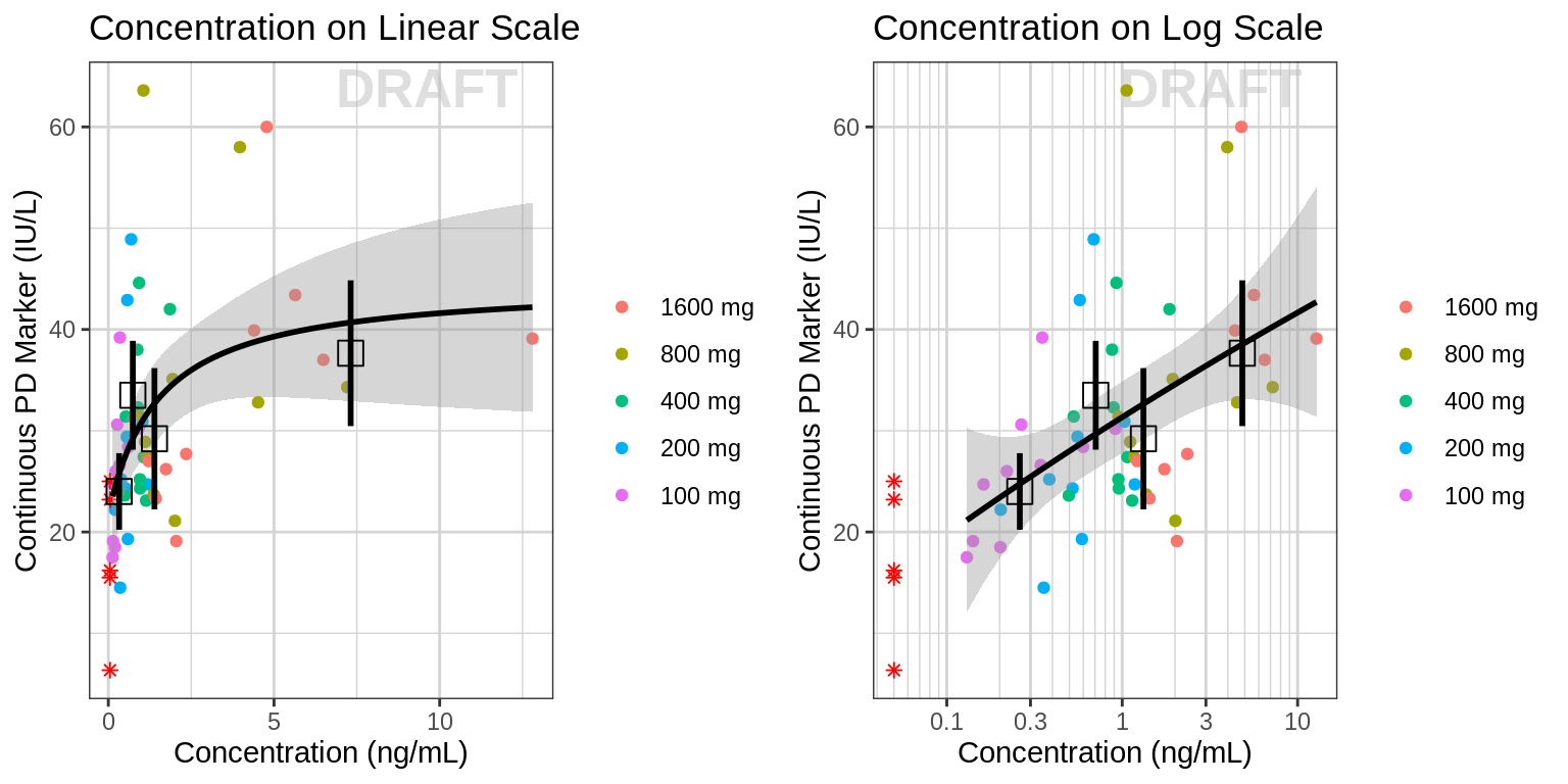
PD marker by Concentration, faceted by visit, mean (95% CI) by concentration bins
data_to_plot <- pkpd_data_wide %>% subset(PROFDAY %in% PD_PROFDAYS,)

gg <- ggplot(data = data_to_plot,
             aes(x = CONC, y = PD))
gg <- gg + xgx_annotate_status(status)
gg <- gg + geom_point(aes(color = TRTACT_high2low))
gg <- gg + geom_point(data = data_to_plot %>% subset(CENS==1,), color="red", shape = 8)
gg <- gg + guides(color = guide_legend(""), fill = guide_legend(""))
gg <- gg + labs(x = conc_label , y = pd_label)
gg <- gg + xgx_stat_ci(bins = 4, geom = "point", shape = 0, size = 4)
gg <- gg + xgx_stat_ci(bins = 4, geom = "errorbar")
gg <- gg + facet_grid(~DAY_label)

gg1 <- gg + xgx_geom_smooth_emax(color = "black") + ggtitle("Concentration on Linear Scale")
gg2 <- gg + xgx_geom_smooth(color = "black", method = "nlsLM", formula = y ~ E0 + Emax*x/(ED50 + x),
                     method.args = list(
                         start = list(Emax = 1, ED50 = 5, E0 = 1),
                         lower = c(-Inf, 0, -Inf))) +
  xgx_scale_x_log10() + ggtitle("Concentration on Log Scale")

grid.arrange(gg1,gg2,nrow = 2)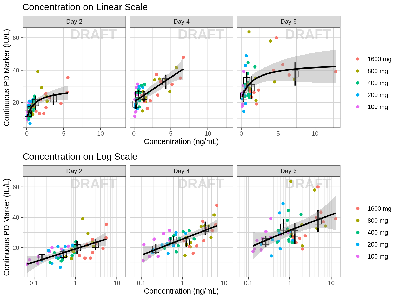
Plotting AUC vs response instead of concentration vs response may make more sense in some situations. For example, when there is a large delay between PK and PD it would be diffcult to relate the time-varying concentration with the response. If rich sampling is only done at a particular point in the study, e.g. at steady state, then the AUC calculated on the rich profile could be used as the exposure variable for a number of PD visits. If PK samples are scarce, average Cmin could also be used as the exposure metric.
gg <- ggplot(data = NCA, aes(x = VALUE, y = PD))
gg <- gg + xgx_annotate_status(status)
gg <- gg + geom_point(aes(color = TRTACT_high2low))

gg <- gg + xgx_geom_smooth_emax(color = "black")
## Note: if the above line doesn't work, try modifying the formula,
##       initial estimates, or lower bounds in the following code
# gg <- gg + xgx_geom_smooth(color = "black", method = "nlsLM",
#                            formula = y ~ E0 + Emax*x/(ED50 + x),
#                            method.args = list(
#                              start = list(Emax = 1, ED50 = 1, E0 = 1),
#                              lower = c(-Inf, 0, -Inf)))

gg <- gg + xgx_stat_ci(bins = 4, geom = "errorbar")
gg <- gg + xgx_stat_ci(bins = 4, geom = "point", shape = 0, size = 4)
gg <- gg + guides(color = guide_legend(""), fill = guide_legend(""))
gg <- gg + labs(color = trtact_label, x = "NCA parameter", y = pd_label)
gg <- gg + facet_wrap(~DAY_label + PARAM, scales = "free_x")
print(gg)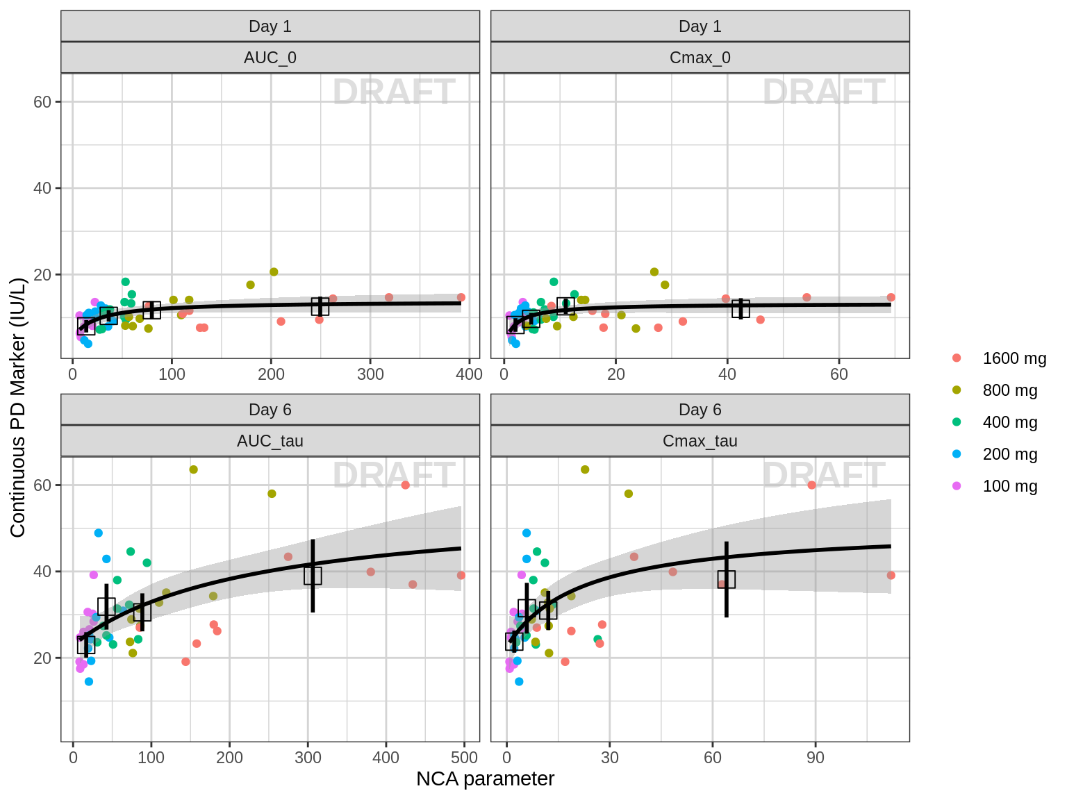
Explore covariate effects on Exposure-Response Relationship
Stratify exposure-response plots by covariates of interest to explore whether any key covariates impact response independent of exposure.
gg <- ggplot(data = NCA, aes(x = VALUE, y = PD))
gg <- gg + xgx_annotate_status(status)
gg <- gg + geom_point(aes(color = SEX))

gg <- gg + xgx_geom_smooth_emax(aes(color = SEX))
## Note: if the above line doesn't work, try modifying the formula,
##       initial estimates, or lower bounds in the following code
# gg <- gg + xgx_geom_smooth(aes(color = SEX), method = "nlsLM",
#                            formula = y ~ E0 + Emax*x/(ED50 + x),
#                            method.args = list(
#                              start = list(Emax = 1, ED50 = 1, E0 = 1),
#                              lower = c(-Inf, 0, -Inf)))

gg <- gg + guides(color = guide_legend(""), fill = guide_legend(""))
gg <- gg + labs(x = AUC_units , y = pd_label)
gg + facet_grid(.~DAY_label) 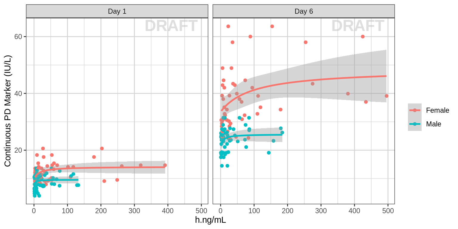
Individual response vs exposure hysteresis plots
Using geom_path you can create hysteresis plots of response vs exposure. Including details like arrows or colors can be helpful to indicate the direction of time.
If most of the arrows point up and to the right or down and to the left, this indicates a positive relationship between exposure and response (i.e. increasing exposure -> increasing response). Arrows pointing down and to the right or up and to the left indicate a negative relationship.
In a hysteresis plot, you want to determine whether the path is curving, and if so in what direction. If you detect a curve in the hysteresis plot, this indicates there is a delay between the exposure and the response. Normally, a clockwise turn indicates that increasing exposure is associated with (a delayed) increasing response, while a counter clockwise turn indicates increasing concentration gives (a delayed) decreasing response.
In the plots below, most of the hysteresis paths follow a counter clockwise turn, with most arrows pointing up and to the right or down and to the left, indicating the effect increases in a delayed manner with increasing concentration.
pkpd_data_wide <- pkpd_data_wide %>% arrange(ID, TIME)

gg <- ggplot(data = pkpd_data_wide, aes(x = CONC, y = PD, color = TIME))
gg <- gg + xgx_annotate_status(status)
gg <- gg + geom_path(arrow = arrow(length = unit(0.15,"cm")))
gg <- gg + labs(x = conc_label , y = pd_label)
gg <- gg + xgx_scale_x_log10()
gg <- gg + xgx_scale_y_log10()
gg <- gg + theme(panel.grid.minor.x = ggplot2::element_line(color = rgb(0.9,0.9,0.9)),
                 panel.grid.minor.y = ggplot2::element_line(color = rgb(0.9,0.9,0.9)))

gg + facet_wrap(~ID + TRTACT_low2high, ncol = 5)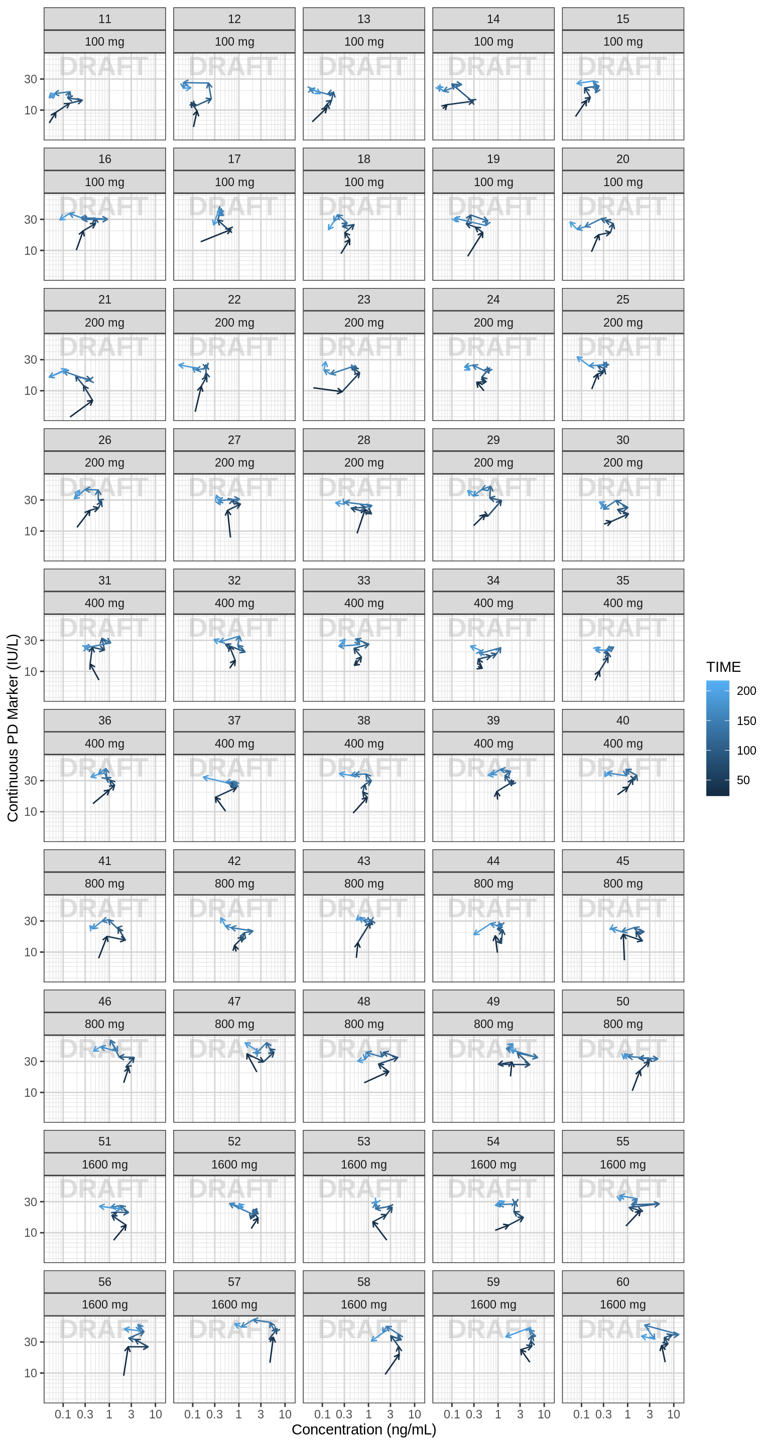
R Session Info
sessionInfo()## R version 4.1.0 (2021-05-18)
## Platform: x86_64-pc-linux-gnu (64-bit)
## Running under: Red Hat Enterprise Linux Server 7.9 (Maipo)
##
## Matrix products: default
## BLAS/LAPACK: /CHBS/apps/EB/software/imkl/2019.1.144-gompi-2019a/compilers_and_libraries_2019.1.144/linux/mkl/lib/intel64_lin/libmkl_gf_lp64.so
##
## locale:
## [1] LC_CTYPE=en_US.UTF-8 LC_NUMERIC=C LC_TIME=en_US.UTF-8 LC_COLLATE=en_US.UTF-8 LC_MONETARY=en_US.UTF-8
## [6] LC_MESSAGES=en_US.UTF-8 LC_PAPER=en_US.UTF-8 LC_NAME=C LC_ADDRESS=C LC_TELEPHONE=C
## [11] LC_MEASUREMENT=en_US.UTF-8 LC_IDENTIFICATION=C
##
## attached base packages:
## [1] stats graphics grDevices utils datasets methods base
##
## other attached packages:
## [1] survminer_0.4.9 ggpubr_0.4.0 survival_3.4-0 knitr_1.40 broom_1.0.1 caTools_1.18.2 DT_0.26 forcats_0.5.2 stringr_1.4.1
## [10] purrr_0.3.5 readr_2.1.3 tibble_3.1.8 tidyverse_1.3.2 xgxr_1.1.1 zoo_1.8-11 gridExtra_2.3 tidyr_1.2.1 dplyr_1.0.10
## [19] ggplot2_3.3.6
##
## loaded via a namespace (and not attached):
## [1] googledrive_2.0.0 colorspace_2.0-3 ggsignif_0.6.2 deldir_1.0-6 rio_0.5.27 ellipsis_0.3.2 class_7.3-19
## [8] htmlTable_2.2.1 markdown_1.2 base64enc_0.1-3 fs_1.5.2 gld_2.6.2 rstudioapi_0.14 proxy_0.4-26
## [15] farver_2.1.1 Deriv_4.1.3 fansi_1.0.3 mvtnorm_1.1-3 lubridate_1.8.0 xml2_1.3.3 codetools_0.2-18
## [22] splines_4.1.0 cachem_1.0.6 rootSolve_1.8.2.2 Formula_1.2-4 jsonlite_1.8.3 km.ci_0.5-2 binom_1.1-1
## [29] cluster_2.1.3 dbplyr_2.2.1 png_0.1-7 compiler_4.1.0 httr_1.4.4 backports_1.4.1 assertthat_0.2.1
## [36] Matrix_1.5-1 fastmap_1.1.0 gargle_1.2.1 cli_3.4.1 prettyunits_1.1.1 htmltools_0.5.3 tools_4.1.0
## [43] gtable_0.3.1 glue_1.6.2 lmom_2.8 Rcpp_1.0.9 carData_3.0-4 cellranger_1.1.0 jquerylib_0.1.4
## [50] vctrs_0.5.0 nlme_3.1-160 crosstalk_1.2.0 xfun_0.34 openxlsx_4.2.4 rvest_1.0.3 lifecycle_1.0.3
## [57] rstatix_0.7.0 googlesheets4_1.0.1 MASS_7.3-58.1 scales_1.2.1 hms_1.1.2 expm_0.999-6 RColorBrewer_1.1-3
## [64] curl_4.3.3 yaml_2.3.6 Exact_2.1 KMsurv_0.1-5 pander_0.6.4 sass_0.4.2 rpart_4.1.16
## [71] reshape_0.8.8 latticeExtra_0.6-30 stringi_1.7.8 highr_0.9 e1071_1.7-8 checkmate_2.1.0 zip_2.2.0
## [78] boot_1.3-28 rlang_1.0.6 pkgconfig_2.0.3 bitops_1.0-7 evaluate_0.17 lattice_0.20-45 htmlwidgets_1.5.4
## [85] labeling_0.4.2 tidyselect_1.2.0 GGally_2.1.2 plyr_1.8.7 magrittr_2.0.3 R6_2.5.1 DescTools_0.99.42
## [92] generics_0.1.3 Hmisc_4.7-0 DBI_1.1.3 pillar_1.8.1 haven_2.5.1 foreign_0.8-82 withr_2.5.0
## [99] mgcv_1.8-41 abind_1.4-5 RCurl_1.98-1.4 nnet_7.3-17 car_3.0-11 crayon_1.5.2 modelr_0.1.9
## [106] survMisc_0.5.5 interp_1.1-2 utf8_1.2.2 tzdb_0.3.0 rmarkdown_2.17 progress_1.2.2 jpeg_0.1-9
## [113] grid_4.1.0 readxl_1.4.1 minpack.lm_1.2-1 data.table_1.14.2 reprex_2.0.2 digest_0.6.30 xtable_1.8-4
## [120] munsell_0.5.0 bslib_0.4.0