PK - Multiple Ascending Dose
Alison Margolskee
Overview
This document contains exploratory plots for multiple ascending dose PK data as well as the R code that generates these graphs. The plots presented here are based on simulated data (see: PKPD Datasets). Data specifications can be accessed on Datasets and Rmarkdown template to generate this page can be found on Rmarkdown-Template. You may also download the Multiple Ascending Dose PK/PD dataset for your reference (download dataset).
Setup
library(ggplot2)
library(dplyr)
library(tidyr)
library(xgxr)

#flag for labeling figures as draft
status = "DRAFT"

## ggplot settings
xgx_theme_set()
Load Dataset
#load dataset
pkpd_data <- read.csv("../Data/Multiple_Ascending_Dose_Dataset2.csv")

DOSE_CMT = 1
PK_CMT = 2
SS_PROFDAY = 6 # steady state prof day
TAU = 24 # time between doses, units should match units of TIME, e.g. 24 for QD, 12 for BID, 7*24 for Q1W (when units of TIME are h)

#ensure dataset has all the necessary columns
  pkpd_data = pkpd_data %>%
    mutate(ID      = ID,     #ID   column
           TIME    = TIME,   #TIME column name
           NOMTIME = NOMTIME, #NOMINAL TIME column name
           PROFDAY = case_when(
             NOMTIME < (SS_PROFDAY - 1)*24 ~ 1 + floor(NOMTIME / 24),
             NOMTIME >= (SS_PROFDAY - 1)*24 ~ SS_PROFDAY
             ), #PROFILE DAY day associated with profile, e.g. day of dose administration
           PROFTIME = NOMTIME - (PROFDAY - 1)*24, #PROFILE TIME, time associated with profile, e.g. hours post dose
           LIDV    = LIDV,   #DEPENDENT VARIABLE column name
           CENS    = CENS,   #CENSORING column name
           CMT     = CMT,    #COMPARTMENT column
           DOSE    = DOSE,   #DOSE column here (numeric value)
           TRTACT  = TRTACT, #DOSE REGIMEN column here (character, with units),
           LIDV_NORM = LIDV/DOSE,
           LIDV_UNIT = EVENTU,
           DAY_label = paste("Day", PROFDAY)
    )

#create a factor for the treatment variable for plotting
pkpd_data = pkpd_data %>%
  arrange(DOSE) %>%
  mutate(TRTACT_low2high = factor(TRTACT, levels = unique(TRTACT)),
         TRTACT_high2low = factor(TRTACT, levels = rev(unique(TRTACT)))) %>%
  select(-TRTACT)


#create pk dataset
pk_data <- pkpd_data %>%
  filter(CMT == PK_CMT)

#perform NCA, for additional plots
NCA = pk_data %>%
  group_by(ID, DOSE) %>%
  filter(!is.na(LIDV)) %>%
  summarize(AUC_0 = ifelse(length(LIDV[NOMTIME > 0 & NOMTIME <= TAU]) > 1,
                              caTools::trapz(TIME[NOMTIME > 0 & NOMTIME <= TAU],
                                      LIDV[NOMTIME > 0 & NOMTIME <= TAU]),
                              NA),
            Cmax_0     = ifelse(length(LIDV[NOMTIME > 0 & NOMTIME <= TAU]) > 1,
                              max(LIDV[NOMTIME > 0 & NOMTIME <= TAU]),
                              NA),
            AUC_tau = ifelse(length(LIDV[NOMTIME > (SS_PROFDAY-1)*24 &
                                           NOMTIME <= ((SS_PROFDAY-1)*24 + TAU)]) > 1,
                             caTools::trapz(TIME[NOMTIME > (SS_PROFDAY-1)*24 &
                                                   NOMTIME <= ((SS_PROFDAY-1)*24 + TAU)],
                                     LIDV[NOMTIME > (SS_PROFDAY-1)*24 &
                                            NOMTIME <= ((SS_PROFDAY-1)*24 + TAU)]),
                             NA),
            Cmax_tau     = ifelse(length(LIDV[NOMTIME > (SS_PROFDAY-1)*24 &
                                                NOMTIME <= ((SS_PROFDAY-1)*24 + TAU)]) > 1,
                             max(LIDV[NOMTIME > (SS_PROFDAY-1)*24 &
                                        NOMTIME <= ((SS_PROFDAY-1)*24 + TAU)]),
                             NA),
            AUC_acc = AUC_tau / AUC_0,
            Cmax_acc = Cmax_tau / Cmax_0,
            SEX      = SEX[1], #this part just keeps the SEX and WEIGHTB covariates
            WEIGHTB  = WEIGHTB[1]) %>%
  gather(PARAM, VALUE, -c(ID, DOSE, SEX, WEIGHTB)) %>%
  ungroup() %>%
  mutate(VALUE_NORM = VALUE/DOSE,
         PROFDAY = ifelse(PARAM %in% c("AUC_0", "Cmax_0"), 1, SS_PROFDAY),
         DAY_label = paste("Day", PROFDAY))


#units and labels
  time_units_dataset = "hours"
  time_units_plot    = "days"
  trtact_label       = "Dose"
  dose_units         = unique((pkpd_data %>% filter(CMT == DOSE_CMT) )$LIDV_UNIT) %>% as.character()
  dose_label         = paste0("Dose (", dose_units, ")")
  conc_units         = unique(pk_data$LIDV_UNIT) %>% as.character()
  conc_label         = paste0("Concentration (", conc_units, ")")
  concnorm_label     = paste0("Normalized Concentration (", conc_units, ")/", dose_units)
  AUC_units          = paste0("h.", conc_units)

#directories for saving individual graphs
dirs = list(
  parent_dir = "Parent_Directory",
  rscript_dir  = "./",
  rscript_name = "Example.R",
  results_dir  = "./",
  filename_prefix   = "",
  filename     = "Example.png")
Provide an overview of the data
Summarize the data in a way that is easy to visualize the general trend of PK over time and between doses. Using summary statistics can be helpful, e.g. Mean +/- SE, or median, 5th & 95th percentiles. Consider either coloring by dose or faceting by dose. Depending on the amount of data one graph may be better than the other.
When looking at summaries of PK over time, there are several things to observe. Note the number of doses and number of time points or sampling schedule. Observe the overall shape of the average profiles. What is the average Cmax per dose? Tmax? Does the elimination phase appear to be parallel across the different doses? Is there separation between the profiles for different doses? Can you make a visual estimate of the number of compartments that would be needed in a PK model?
Concentration over Time, colored by dose, mean +/- 95% CI
gg <- ggplot(data = pk_data,
             aes(x = NOMTIME, y = LIDV,
                 group = interaction(TRTACT_high2low, PROFDAY), color = TRTACT_high2low))
gg <- gg + xgx_theme()
gg <- gg + xgx_geom_ci(conf_level = 0.95, alpha = 0.5)
gg <- gg + xgx_scale_y_log10()
gg <- gg + xgx_scale_x_time_units(units_dataset = time_units_dataset,
                                  units_plot    = time_units_plot)
gg <- gg + labs(y = conc_label, color = trtact_label)
gg <- gg + xgx_annotate_status(status)
gg <- gg + xgx_annotate_filenames(dirs)

#if saving copy of figure, replace xgx_annotate lines with xgx_save() shown below:
#xgx_save(width, height, dirs, "filename_main", status)
print(gg)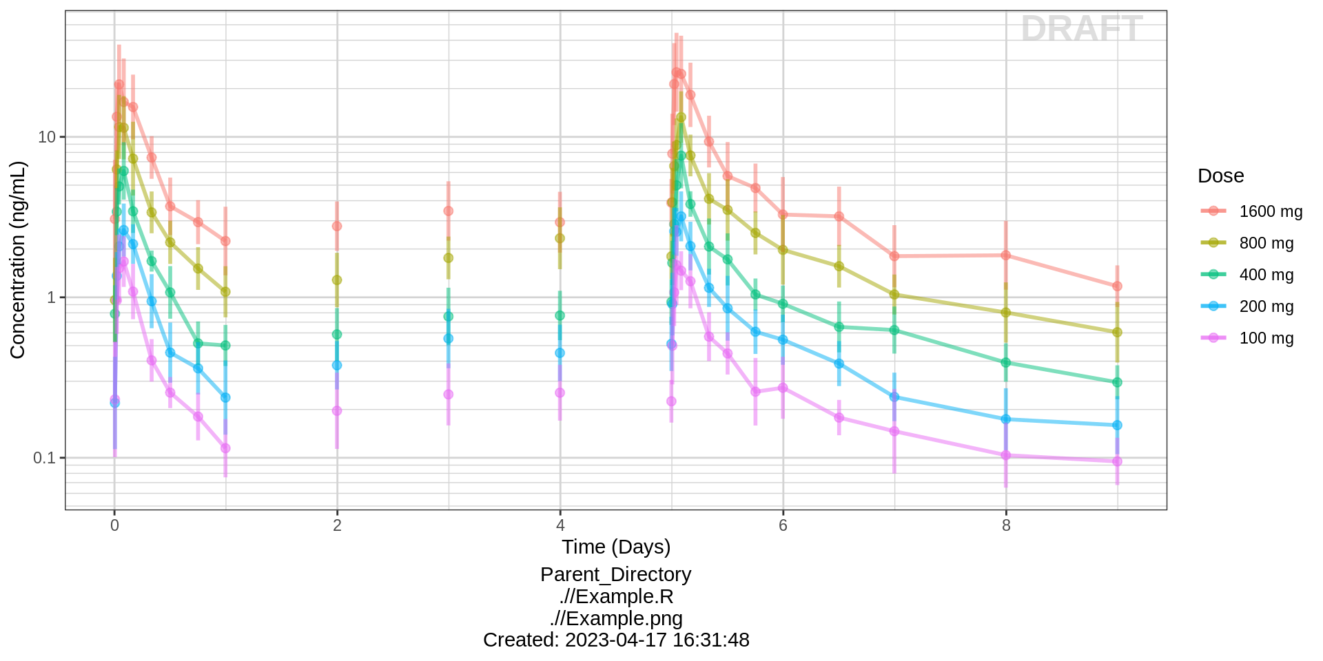
Side-by-side comparison of first administered dose and steady state
For multiple dose studies, zoom in on key visits for a clearer picture of the profiles. Look for accumulation (if any) between first administered dose and steady state.
data_to_plot <- pk_data %>% subset(PROFDAY %in% c(1, SS_PROFDAY))

gg %+%
  data_to_plot %+%
  aes(x = PROFTIME) +
  facet_grid(~DAY_label) +
  xgx_scale_x_time_units(units_dataset = time_units_dataset,
                         units_plot    = "Hours")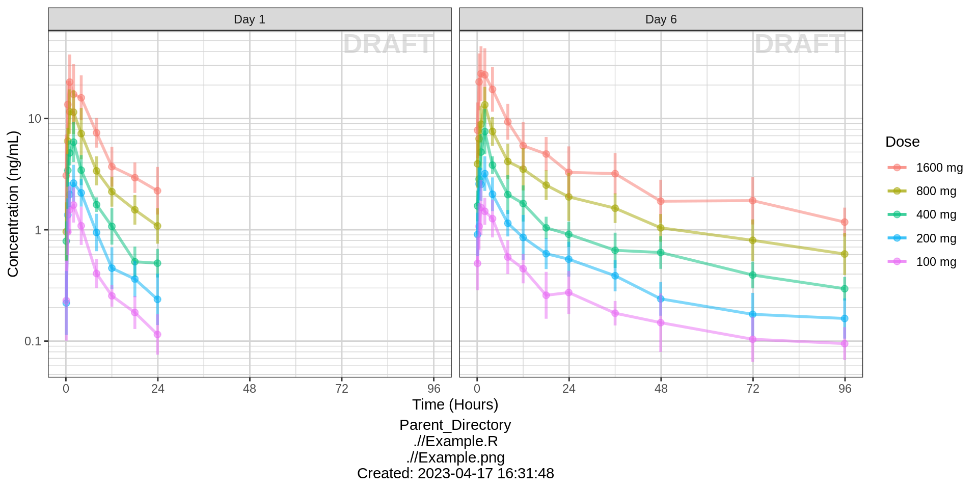
Concentration over Time, faceted by dose, mean +/- 95% CI, overlaid on gray spaghetti plots
gg <- ggplot(data = pk_data, aes(x = NOMTIME, y = LIDV, group = interaction(TRTACT_high2low, PROFDAY)))
gg <- gg + xgx_theme()
gg <- gg + geom_line(aes(group = interaction(ID, PROFDAY)), color = rgb(0.5, 0.5, 0.5), size = 1, alpha = 0.3)
gg <- gg + geom_point(aes(color = factor(CENS), shape = factor(CENS), alpha = 0.3), size = 2, alpha = 0.3)
gg <- gg + scale_shape_manual(values = c(19, 8))
gg <- gg + scale_color_manual(values = c("grey50", "red"))
gg <- gg + theme(legend.position = "none")
gg <- gg + xgx_geom_ci(conf_level = 0.95)
gg <- gg + xgx_scale_y_log10()
gg <- gg + xgx_scale_x_time_units(units_dataset = time_units_dataset,
                                  units_plot    = time_units_plot)
gg <- gg + labs(y = conc_label, color = trtact_label)
gg <- gg + xgx_annotate_status(status)
gg <- gg + xgx_annotate_filenames(dirs)
gg <- gg + facet_grid(.~TRTACT_low2high)

#if saving copy of figure, replace xgx_annotate lines with xgx_save() shown below:
#xgx_save(width, height, dirs, "filename_main", status)
print(gg)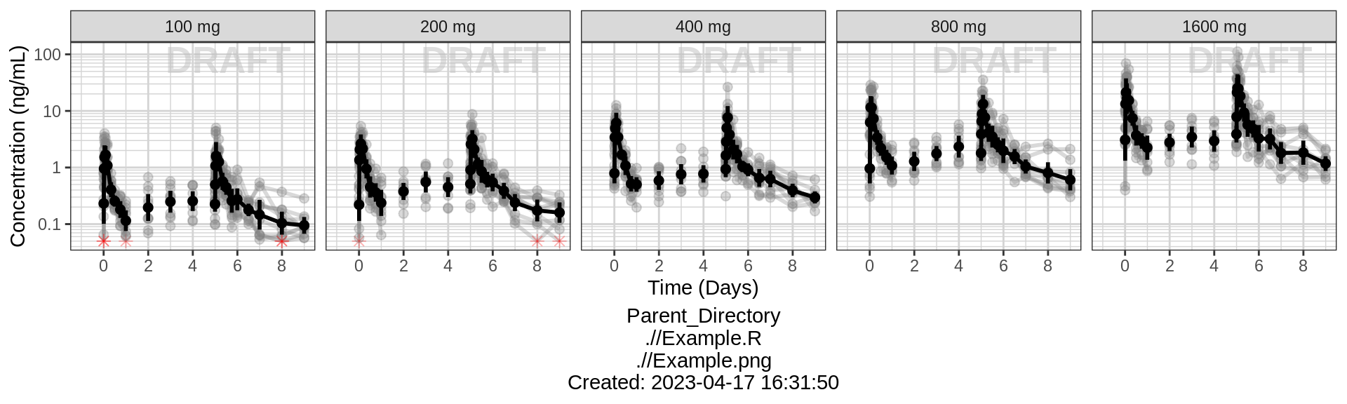
Explore variability
Use spaghetti plots to visualize the extent of variability between individuals. The wider the spread of the profiles, the higher the between subject variability. Distinguish different doses by color, or separate into different panels. If coloring by dose, do the individuals in the different dose groups overlap across doses? Dose there seem to be more variability at higher or lower concentrations?
Concentration over Time, colored by dose, dots and lines grouped by individual
gg <- ggplot(data = pk_data, aes(x = TIME, y = LIDV))
gg <- gg + xgx_theme()
gg <- gg + geom_line(aes(group = interaction(ID, PROFDAY), color = TRTACT_high2low), size = 1, alpha = 0.5)
gg <- gg + geom_point(aes(alpha = 0.3, color = TRTACT_high2low), size = 2, alpha = 0.5)
gg <- gg + geom_point(aes(shape = factor(CENS), alpha = 0.3), size = 2, alpha = 0.5, color = "red")
gg <- gg + scale_shape_manual(values = c(NA, 8))
gg <- gg + xgx_scale_y_log10()
gg <- gg + xgx_scale_x_time_units(units_dataset = time_units_dataset,
                                  units_plot    = time_units_plot)
gg <- gg + labs(y = conc_label, color = trtact_label, shape = "BLQ")
gg <- gg + xgx_annotate_status(status)
gg <- gg + xgx_annotate_filenames(dirs)

#if saving copy of figure, replace xgx_annotate lines with xgx_save() shown below:
#xgx_save(width, height, dirs, "filename_main", status)
print(gg)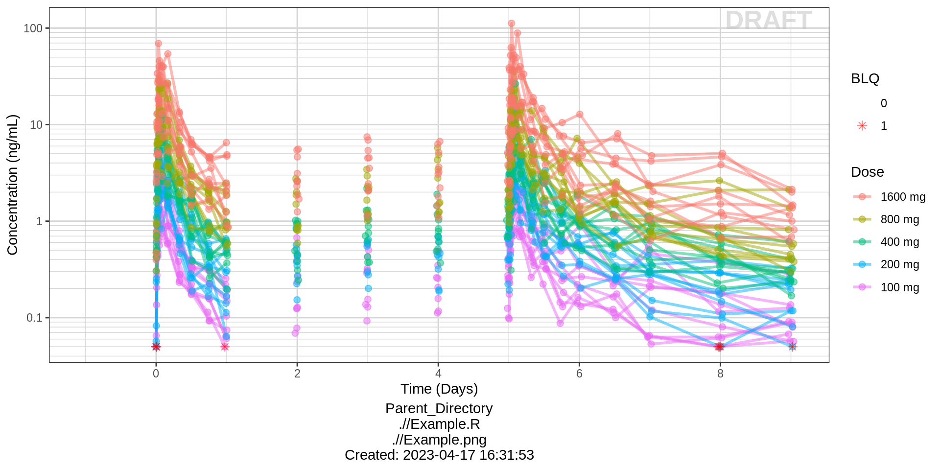
Side-by-side comparison of first administered dose and steady state
gg %+%
  (pk_data %>% subset(PROFDAY %in% c(1, SS_PROFDAY))) %+%
  aes(x = PROFTIME) +
  xgx_scale_x_time_units(units_dataset = time_units_dataset,
                        units_plot    = "Hours") +
  facet_grid(~DAY_label)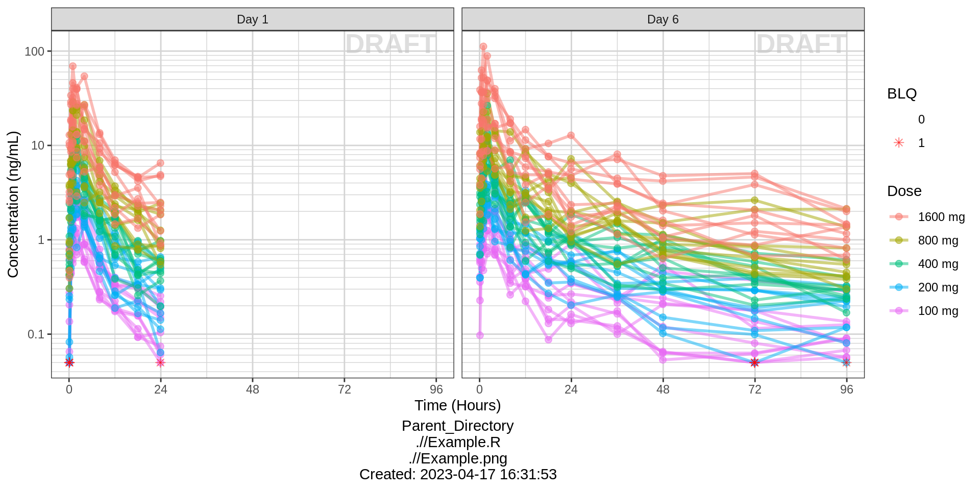
Concentration over Time, faceted by dose, lines grouped by individual
gg <- ggplot(data = pk_data, aes(x = TIME, y = LIDV))
gg <- gg + xgx_theme()
gg <- gg + geom_line(aes(group = interaction(ID, PROFDAY)), size = 1, alpha = 0.5)
gg <- gg + geom_point(data = pk_data %>% filter(CENS == 0), size = 2, alpha = 0.5)
gg <- gg + geom_point(data = pk_data %>% filter(CENS == 1), size = 2, alpha = 0.5, color = "red", shape = 8)
gg <- gg + xgx_scale_y_log10()
gg <- gg + xgx_scale_x_time_units(units_dataset = time_units_dataset,
                                  units_plot    = time_units_plot)
gg <- gg + labs(y = conc_label)
gg <- gg + facet_grid(.~TRTACT_low2high)
gg <- gg + xgx_annotate_status(status)
gg <- gg + xgx_annotate_filenames(dirs)

#if saving copy of figure, replace xgx_annotate lines with xgx_save() shown below:
#xgx_save(width, height, dirs, "filename_main", status)
print(gg)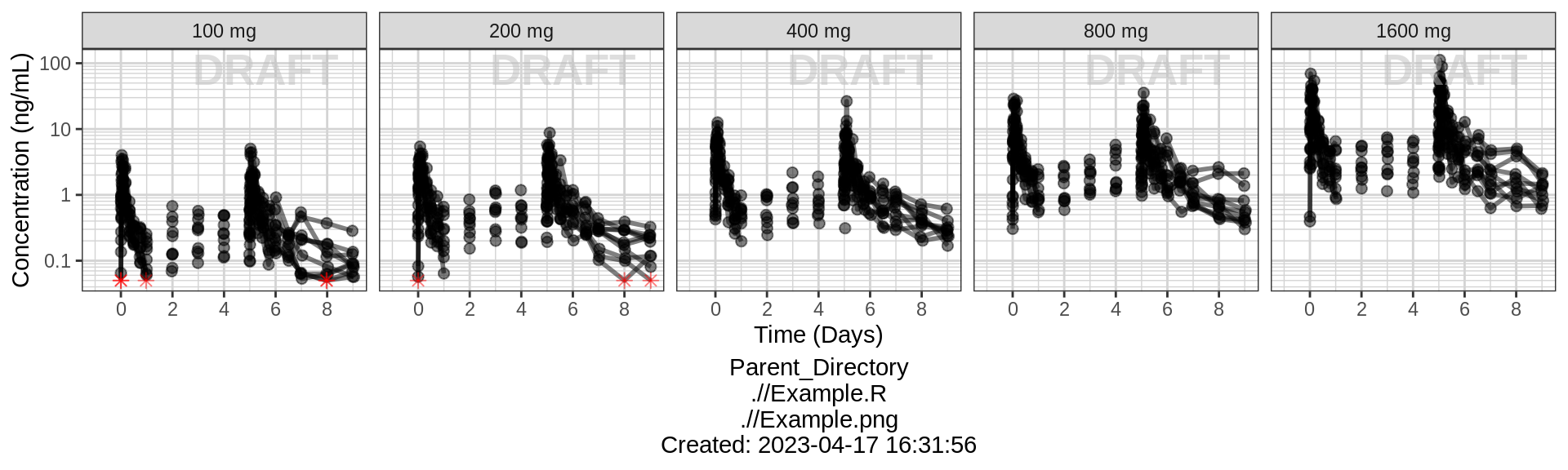
Assess the dose linearity of exposure
Dose Normalized Concentration over Time, colored by dose, mean +/- 95% CI
gg <- ggplot(data = pk_data,
             aes(x = NOMTIME, y = LIDV_NORM,
                 group = TRTACT_high2low, color = TRTACT_high2low))
gg <- gg + xgx_theme()
gg <- gg + xgx_geom_ci(conf_level = 0.95, alpha = 0.5)
gg <- gg + xgx_scale_y_log10()
gg <- gg + xgx_scale_x_time_units(units_dataset = time_units_dataset,
                                  units_plot    = time_units_plot)

gg <- gg + labs(y = concnorm_label, color = trtact_label)
gg <- gg + xgx_annotate_status(status)
gg <- gg + xgx_annotate_filenames(dirs)

#if saving copy of figure, replace xgx_annotate lines with xgx_save() shown below:
#xgx_save(width, height, dirs, "filename_main", status)
print(gg)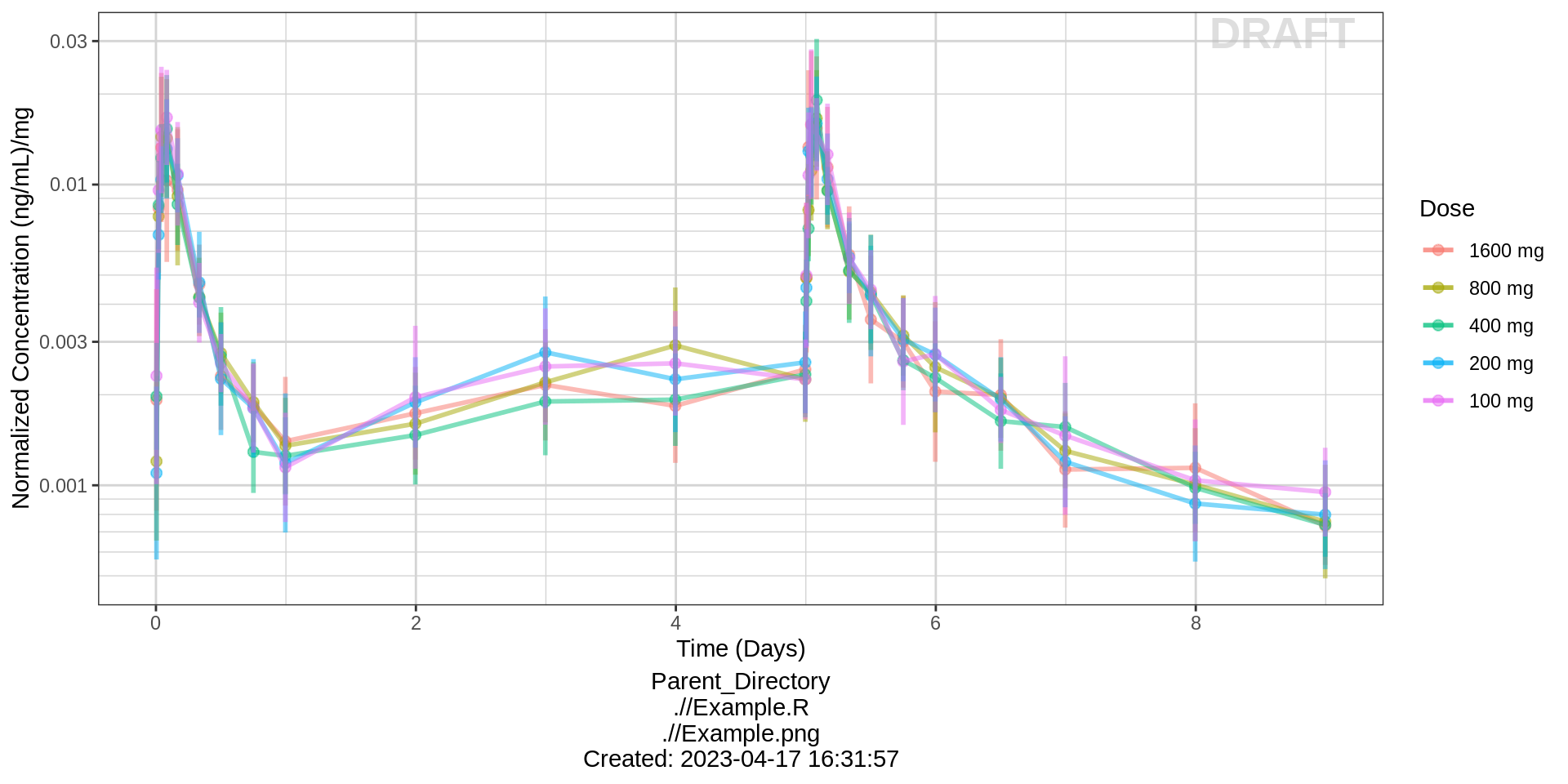
Side-by-side comparison of first administered dose and steady state
gg %+%
  (pk_data %>% subset(PROFDAY %in% c(1, SS_PROFDAY))) %+%
  aes(x = PROFTIME) +
  xgx_scale_x_time_units(units_dataset = time_units_dataset,
                         units_plot    = "Hours") +
  facet_grid(~DAY_label) +
xlab("Time after dose (hours)") 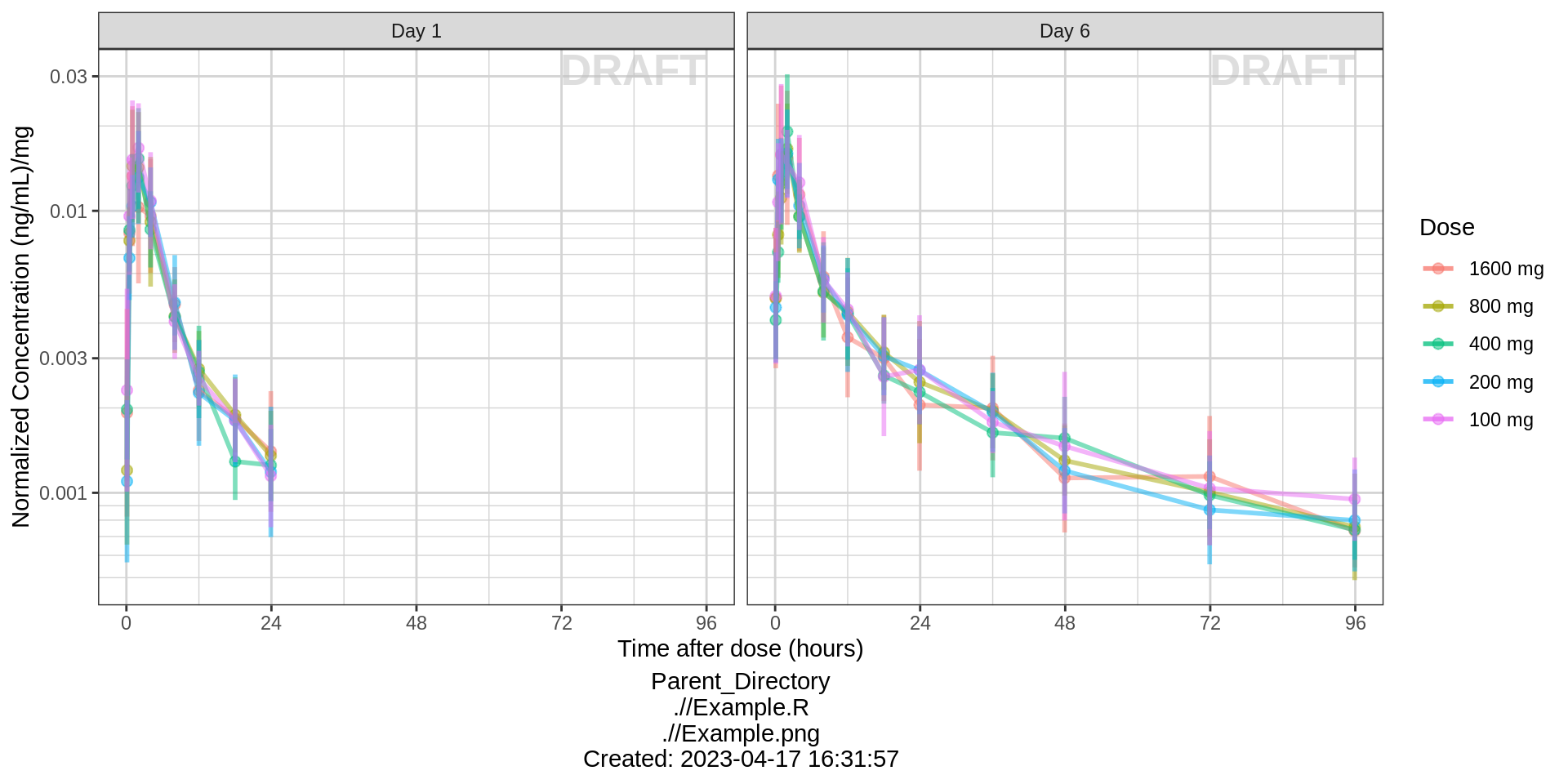
NCA of dose normalized AUC vs Dose
Observe the dose normalized AUC over different doses. Does the relationship appear to be constant across doses or do some doses stand out from the rest? Can you think of reasons why some would stand out? For example, the lowest dose may have dose normalized AUC much higher than the rest, could this be due to CENS observations? If the highest doses have dose normalized AUC much higher than the others, could this be due to nonlinear clearance, with clearance saturating at higher doses? If the highest doses have dose normalized AUC much lower than the others, could there be saturation of bioavailability, reaching the maximum absorbable dose?
gg <- ggplot(data = NCA %>% subset(PARAM %in% c("AUC_0", "AUC_tau")), aes(x = DOSE, y = VALUE_NORM))
gg <- gg + geom_boxplot(aes(group = DOSE)) + geom_smooth(method = "lm", color = "black")
gg <- gg + scale_x_continuous(breaks = unique(NCA$DOSE))
gg <- gg + ylab("Dose normalized AUCtau (h.(ng/mL)/mg)")
gg <- gg + xlab("Dose (mg)")
gg <- gg + xgx_annotate_status(status)
gg <- gg + xgx_annotate_filenames(dirs)

#if saving copy of figure, replace xgx_annotate lines with xgx_save() shown below:
#xgx_save(width, height, dirs, "filename_main", status)
print(gg + facet_grid(.~DAY_label))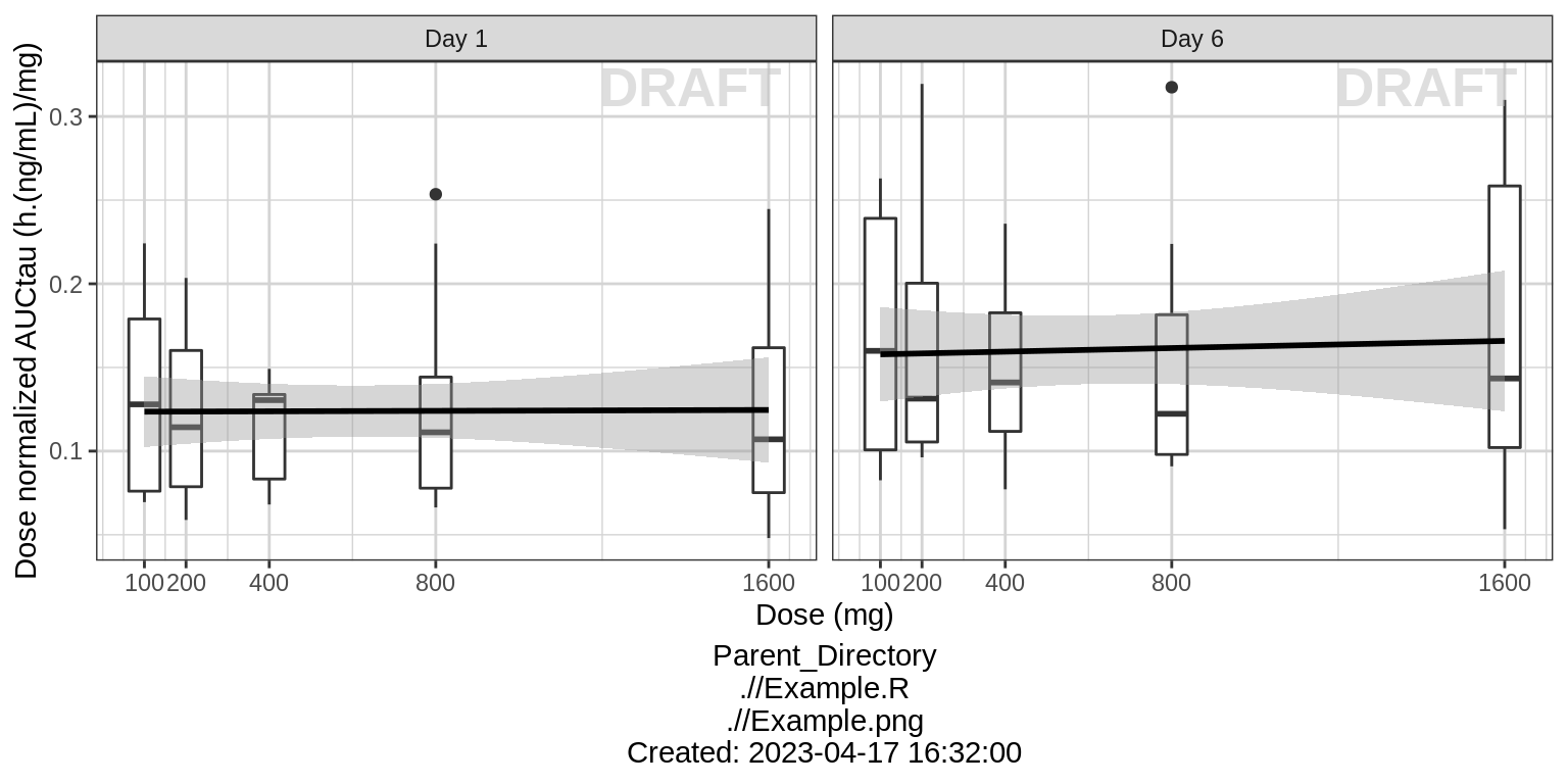
For multiple ascending dose studies, plot the ratio between the steady state AUC and the AUC from the first dose administration. Is there any accumulation?
gg %+%
  (NCA %>% subset(PARAM == "AUC_acc")) +
  aes(y = VALUE) +
  geom_hline(yintercept = 1, linetype = "dashed") +
  xgx_scale_y_log10(breaks = c(0.5, 1, 2)) +
  coord_cartesian(ylim = c(0.5, 3)) +
  ylab("Fold Accumulation in AUCtau")
NCA of dose normalized Cmax vs Dose
gg %+%
(NCA %>% subset(PARAM %in% c("Cmax_0", "Cmax_tau"))) +
facet_grid(.~DAY_label) +
ylab("Dose normalized Cmax (ng/mL)/mg") 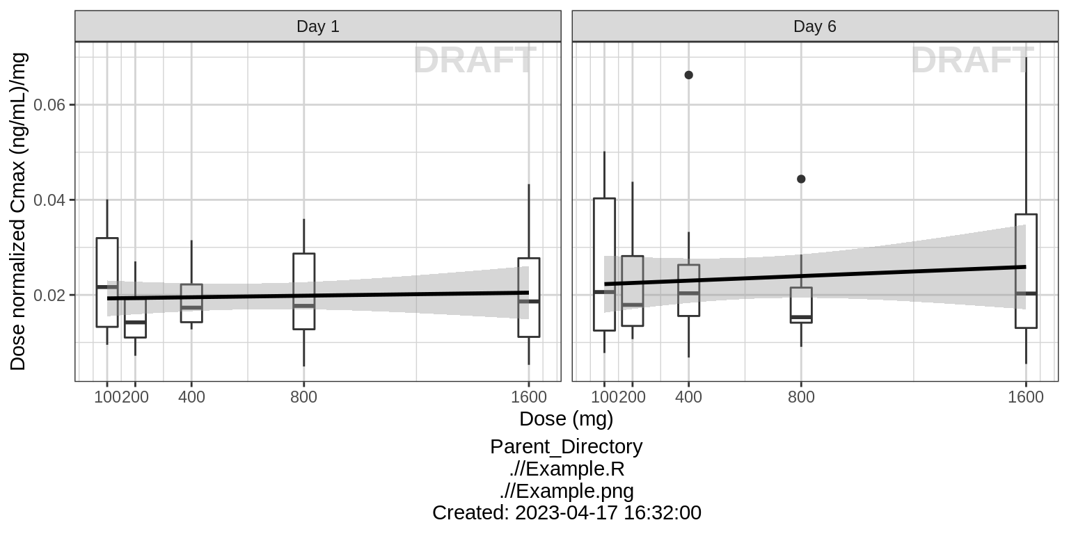 For multiple ascending dose studies, plot the
ratio between the steady state Cmax and the Cmax from the first dose
administration. Is there any accumulation?
For multiple ascending dose studies, plot the
ratio between the steady state Cmax and the Cmax from the first dose
administration. Is there any accumulation?
gg %+%
  (NCA %>% subset(PARAM == "Cmax_acc")) +
  aes(y = VALUE) +
  geom_hline(yintercept = 1, linetype = "dashed") +
  xgx_scale_y_log10(breaks = c(0.5, 1, 2)) +
  coord_cartesian(ylim = c(0.25, 4)) +
  ylab("Fold Accumulation in Cmax")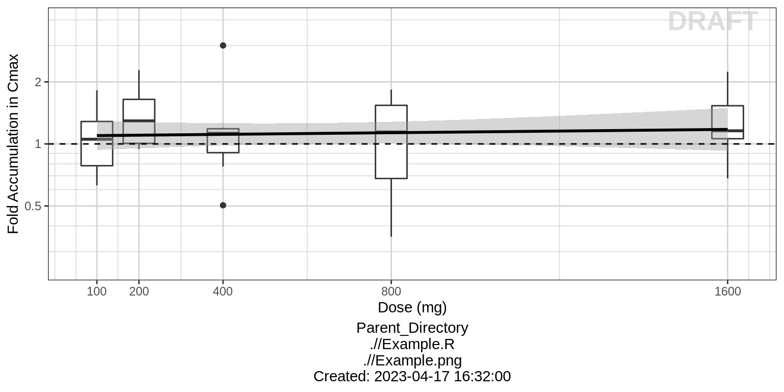
Explore irregularities in profiles
Plot individual profiles in order to inspect them for any irregularities. Inspect the profiles for outlying data points that may skew results or bias conclusions. Looking at the shapes of the individual profiles now, do they support your observations made about the mean profile (e.g. number of compartments, typical Cmax, Tmax)?
Plotting individual profiles on top of gray spaghetti plots puts individual profiles into context, and may help identify outlying individuals for further inspection. Are there any individuals that appear to have very high or low Cmax compared to others within the same dose group? What about the timing of Cmax? What about the slope of the elimination phase? Does it appear that any subjects could have received an incorrect dose?
Concentration over Time, faceted by individual, individual line plots overlaid on gray spaghetti plots for that dose group
# In order to plot grayed out spaghetti plots by dose with individuals highlighted,
# a new dataset needs to be defined that groups the individuals by dose
pk_data_rep_by_trt <- list()
for(id in unique(pk_data$ID)){
  indiv_data <- pk_data %>% subset(ID == id)
  itrtact = unique(indiv_data$TRTACT_low2high)

  pk_data_rep_by_trt[[as.character(id)]] <- pk_data %>%
        subset(TRTACT_low2high == itrtact) %>%
        mutate(ID_rep_by_trt = ID, ID = id)
}
pk_data_rep_by_trt <- bind_rows(pk_data_rep_by_trt)

gg <- ggplot(mapping = aes(x = TIME, y = LIDV))
# Plot gray underlaid spaghettis
gg <- gg + geom_line(data = pk_data_rep_by_trt,
                     aes(group = interaction(ID_rep_by_trt, PROFDAY)),
                     size = 1, color = rgb(0.5, 0.5, 0.5), alpha = 0.3)
gg <- gg + geom_point(data = pk_data_rep_by_trt,
                     size = 1, color = rgb(0.5, 0.5, 0.5), alpha = 0.3)
# plot overlaid individuals
gg <- gg + geom_line(data = pk_data,
                     aes(group = interaction(ID, PROFDAY)), size = 1)
gg <- gg + geom_point(data = pk_data %>% filter(CENS == 0), size = 1)
gg <- gg + geom_point(data = pk_data %>% filter(CENS == 1),
                      color = "red",  shape = 8, size = 2)
gg <- gg + xgx_scale_y_log10()
gg <- gg + xgx_scale_x_time_units(units_dataset = time_units_dataset,
                                  units_plot    = time_units_plot)
gg <- gg + labs(y = conc_label)
gg <- gg + theme(legend.position = "none")
gg <- gg + facet_wrap(~ID + TRTACT_low2high,
                ncol = 10 )
gg <- gg + xgx_annotate_status(status, fontsize = 4, color = rgb(0.5, 0.5, 1))
gg <- gg + xgx_annotate_filenames(dirs)
gg <- gg + theme(panel.grid.minor.x = ggplot2::element_line(color = rgb(0.9,0.9,0.9)),
      panel.grid.minor.y = ggplot2::element_line(color = rgb(0.9,0.9,0.9)))

#if saving copy of figure, replace xgx_annotate lines with xgx_save() shown below:
#xgx_save(width, height, dirs, "filename_main", status)
print(gg)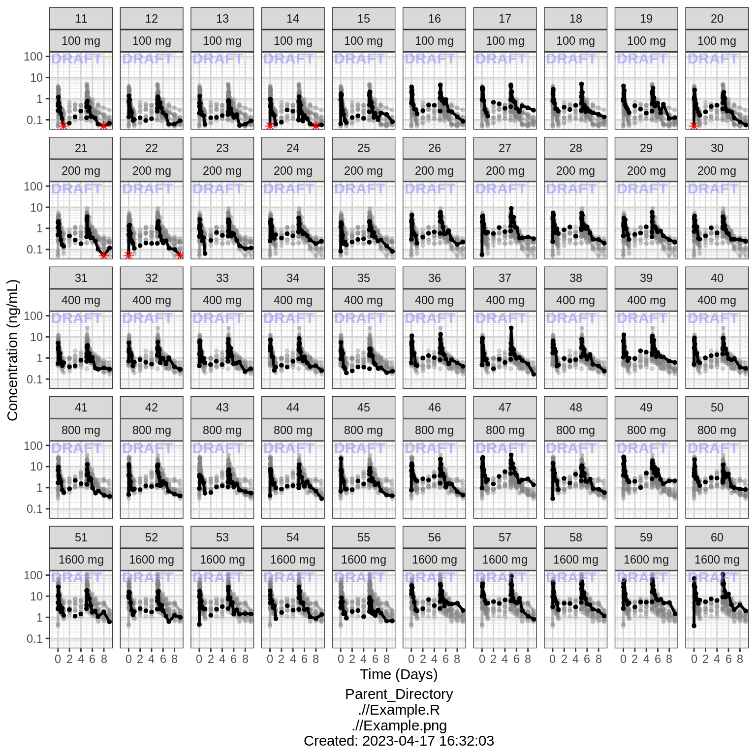
Explore covariate effects on PK
Concentration over Time, colored by categorical covariate, mean +/- 95% CI
gg <- ggplot(data = pk_data, aes(x = NOMTIME, y = LIDV, color = SEX))
gg <- gg + xgx_theme()
gg <- gg + xgx_geom_ci(conf_level = 0.95)
gg <- gg + xgx_scale_y_log10()
gg <- gg + xgx_scale_x_time_units(units_dataset = time_units_dataset,
                                  units_plot    = time_units_plot)
gg <- gg + ylab(conc_label)
gg <- gg + xgx_annotate_status(status)
gg <- gg + xgx_annotate_filenames(dirs)

#if saving copy of figure, replace xgx_annotate lines with xgx_save() shown below:
#xgx_save(width, height, dirs, "filename_main", status)
print(gg + facet_grid(.~TRTACT_low2high))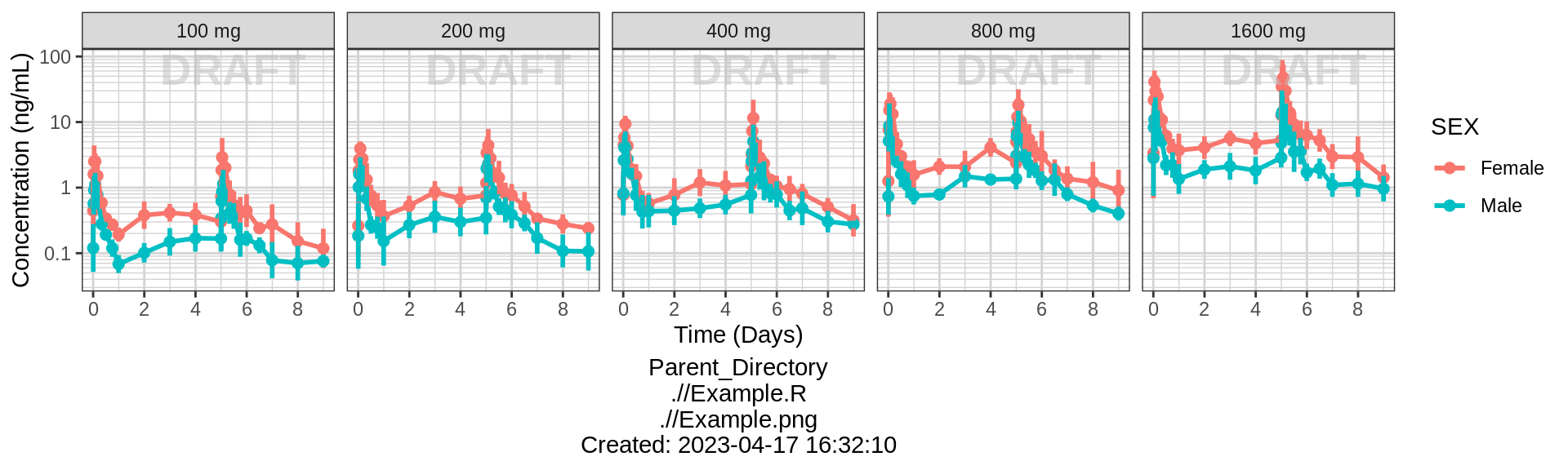
# Same plot colored by weight category
print(gg + facet_grid(.~TRTACT_low2high) + aes(color = WEIGHTB>70))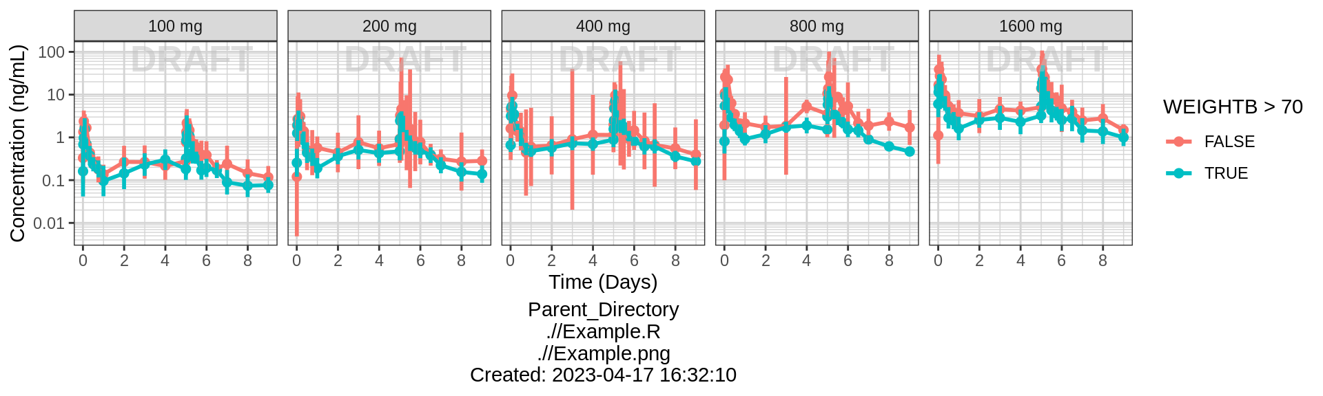
Dose Normalized Concentration over Time, colored by categorical covariate, mean +/- 95% CI
# plotting dose-normalized concentration for all dose groups pooled
print(gg %+% aes(y = LIDV_NORM) + ylab(concnorm_label))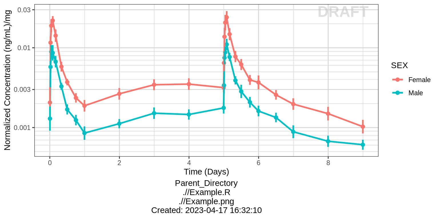
print(gg %+% aes(y = LIDV_NORM) + ylab(concnorm_label) + aes(color = WEIGHTB>70)) 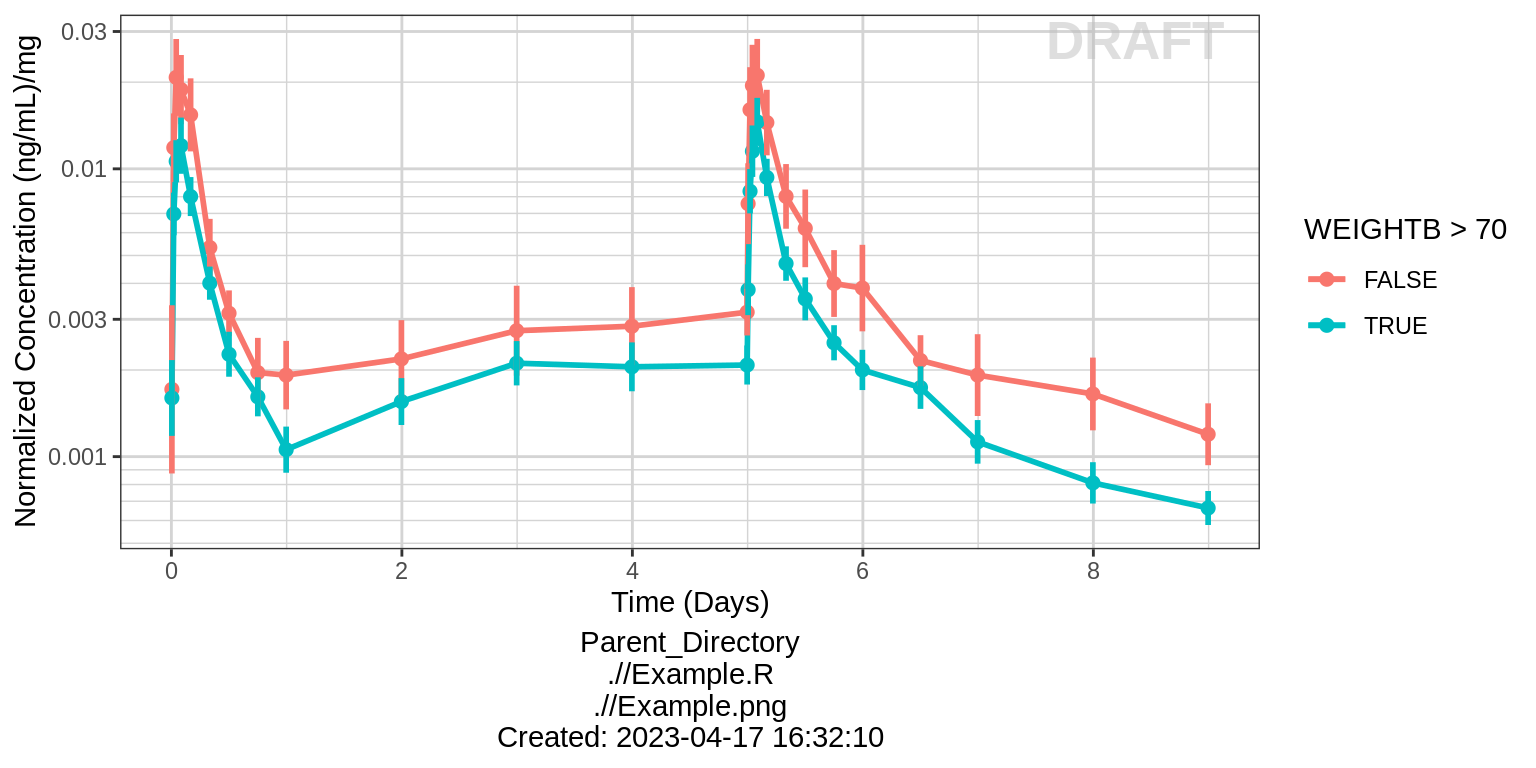
Dose Normalized NCA parameters, stratified by categorical covariate
gg <- ggplot(data = NCA %>% subset(PARAM %in% c("AUC_tau", "Cmax_tau")),
             aes(x = SEX, y = VALUE_NORM))
gg <- gg + geom_boxplot(aes(group = SEX))
gg <- gg + ylab("") + xlab("Sex")
gg <- gg + facet_wrap(~PARAM, scales = "free_y")
gg <- gg + xgx_annotate_status(status)
gg <- gg + xgx_annotate_filenames(dirs)

#if saving copy of figure, replace xgx_annotate lines with xgx_save() shown below:
#xgx_save(width, height, dirs, "filename_main", status)
print(gg)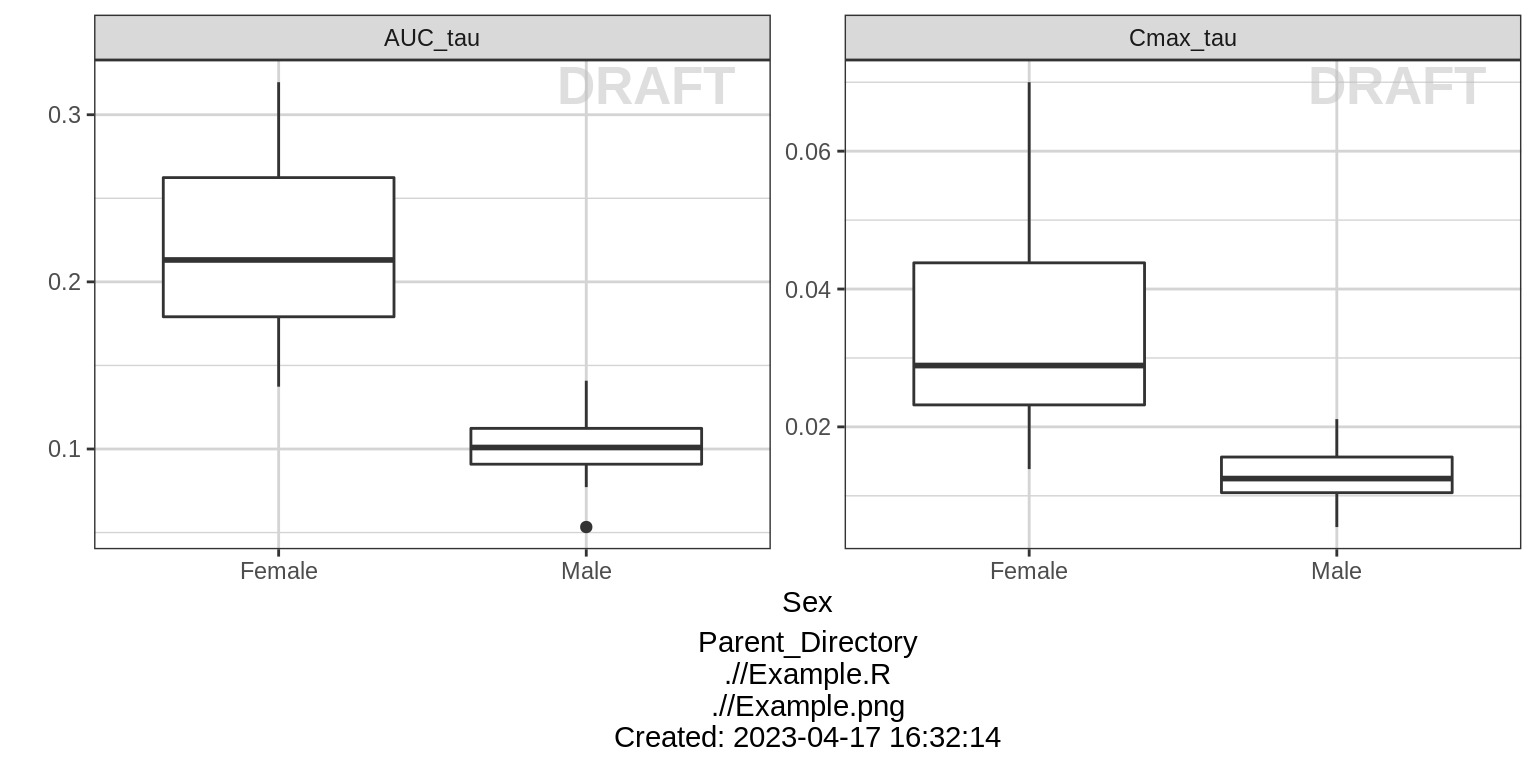
Dose Normalized NCA parameters vs continuous covariate
gg <- ggplot(data = NCA %>% subset(PARAM %in% c("AUC_tau", "Cmax_tau")),
             aes(x = WEIGHTB, y = VALUE_NORM))
gg <- gg + geom_point()
gg <- gg + ylab("") + xlab("Body Weight (kg)")
gg <- gg + facet_wrap(~PARAM, scales = "free_y")
gg <- gg + geom_smooth(method = "lm")
gg <- gg + xgx_annotate_status(status)
gg <- gg + xgx_annotate_filenames(dirs)

#if saving copy of figure, replace xgx_annotate lines with xgx_save() shown below:
#xgx_save(width, height, dirs, "filename_main", status)
print(gg)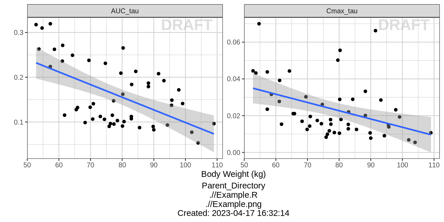
print(gg + aes(color = SEX))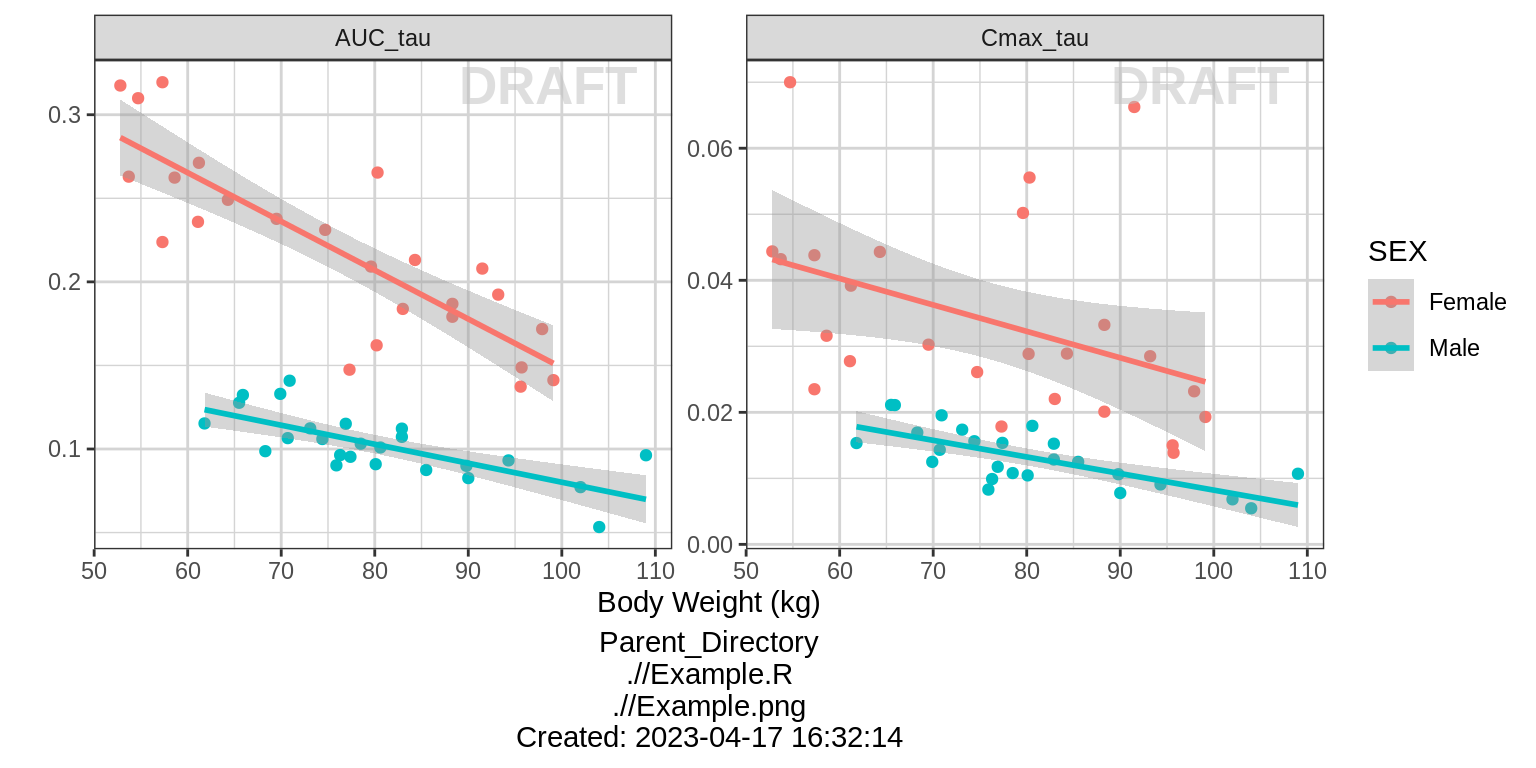
R Session Info
sessionInfo()## R version 4.1.0 (2021-05-18)
## Platform: x86_64-pc-linux-gnu (64-bit)
## Running under: Red Hat Enterprise Linux Server 7.9 (Maipo)
##
## Matrix products: default
## BLAS/LAPACK: /CHBS/apps/EB/software/imkl/2019.1.144-gompi-2019a/compilers_and_libraries_2019.1.144/linux/mkl/lib/intel64_lin/libmkl_gf_lp64.so
##
## locale:
## [1] LC_CTYPE=en_US.UTF-8 LC_NUMERIC=C LC_TIME=en_US.UTF-8 LC_COLLATE=en_US.UTF-8 LC_MONETARY=en_US.UTF-8
## [6] LC_MESSAGES=en_US.UTF-8 LC_PAPER=en_US.UTF-8 LC_NAME=C LC_ADDRESS=C LC_TELEPHONE=C
## [11] LC_MEASUREMENT=en_US.UTF-8 LC_IDENTIFICATION=C
##
## attached base packages:
## [1] stats graphics grDevices utils datasets methods base
##
## other attached packages:
## [1] survminer_0.4.9 ggpubr_0.4.0 survival_3.4-0 knitr_1.40 broom_1.0.1 caTools_1.18.2 DT_0.26 forcats_0.5.2 stringr_1.4.1
## [10] purrr_0.3.5 readr_2.1.3 tibble_3.1.8 tidyverse_1.3.2 xgxr_1.1.1 zoo_1.8-11 gridExtra_2.3 tidyr_1.2.1 dplyr_1.0.10
## [19] ggplot2_3.3.6
##
## loaded via a namespace (and not attached):
## [1] googledrive_2.0.0 colorspace_2.0-3 ggsignif_0.6.2 deldir_1.0-6 rio_0.5.27 ellipsis_0.3.2 class_7.3-19
## [8] htmlTable_2.2.1 markdown_1.2 base64enc_0.1-3 fs_1.5.2 gld_2.6.2 rstudioapi_0.14 proxy_0.4-26
## [15] farver_2.1.1 Deriv_4.1.3 fansi_1.0.3 mvtnorm_1.1-3 lubridate_1.8.0 xml2_1.3.3 codetools_0.2-18
## [22] splines_4.1.0 cachem_1.0.6 rootSolve_1.8.2.2 Formula_1.2-4 jsonlite_1.8.3 km.ci_0.5-2 binom_1.1-1
## [29] cluster_2.1.3 dbplyr_2.2.1 png_0.1-7 compiler_4.1.0 httr_1.4.4 backports_1.4.1 assertthat_0.2.1
## [36] Matrix_1.5-1 fastmap_1.1.0 gargle_1.2.1 cli_3.4.1 prettyunits_1.1.1 htmltools_0.5.3 tools_4.1.0
## [43] gtable_0.3.1 glue_1.6.2 lmom_2.8 Rcpp_1.0.9 carData_3.0-4 cellranger_1.1.0 jquerylib_0.1.4
## [50] vctrs_0.5.0 nlme_3.1-160 crosstalk_1.2.0 xfun_0.34 openxlsx_4.2.4 rvest_1.0.3 lifecycle_1.0.3
## [57] rstatix_0.7.0 googlesheets4_1.0.1 MASS_7.3-58.1 scales_1.2.1 hms_1.1.2 expm_0.999-6 RColorBrewer_1.1-3
## [64] curl_4.3.3 yaml_2.3.6 Exact_2.1 KMsurv_0.1-5 pander_0.6.4 sass_0.4.2 rpart_4.1.16
## [71] reshape_0.8.8 latticeExtra_0.6-30 stringi_1.7.8 highr_0.9 e1071_1.7-8 checkmate_2.1.0 zip_2.2.0
## [78] boot_1.3-28 rlang_1.0.6 pkgconfig_2.0.3 bitops_1.0-7 evaluate_0.17 lattice_0.20-45 htmlwidgets_1.5.4
## [85] labeling_0.4.2 tidyselect_1.2.0 GGally_2.1.2 plyr_1.8.7 magrittr_2.0.3 R6_2.5.1 DescTools_0.99.42
## [92] generics_0.1.3 Hmisc_4.7-0 DBI_1.1.3 pillar_1.8.1 haven_2.5.1 foreign_0.8-82 withr_2.5.0
## [99] mgcv_1.8-41 abind_1.4-5 RCurl_1.98-1.4 nnet_7.3-17 car_3.0-11 crayon_1.5.2 modelr_0.1.9
## [106] survMisc_0.5.5 interp_1.1-2 utf8_1.2.2 tzdb_0.3.0 rmarkdown_2.17 progress_1.2.2 jpeg_0.1-9
## [113] grid_4.1.0 readxl_1.4.1 minpack.lm_1.2-1 data.table_1.14.2 reprex_2.0.2 digest_0.6.30 xtable_1.8-4
## [120] munsell_0.5.0 bslib_0.4.0